Dairy Delight
Simple joys of nourishing living.
- Brand Design
- Visual Design
- UX Design
Organic farm brand identity across poster, web, and app — all-natural, uplifting, communal, from 100+ logo sketches to final touchpoints.
Dairy & Delight is an organic farm brand built around what they call the simple joys of nourishing living — milk, cheese, yogurt, and ice cream delivered direct to customers' homes.
I chose this client over two alternatives because the brief wasn't just 'look fresh and clean.' It was a lifestyle proposition: what you eat and where it comes from matters, and pleasure and integrity belong in the same brand.
Project Overview
Client
Project 02 · Visual Interaction Design (Academic)
Industry
Organic Food · Brand & Multi-Touchpoint
Timeline
3 weeks · Solo
My role
Brand identity, illustration, poster, web & app
Brand filter
All-Natural, Uplifting, Communal — three words that gated every design decision.
Logo process
100+ sketch iterations before vector — two directions alive, one sun mark chosen.
System scope
Poster, landing page, and mobile app — one voice across print, web, and product.
What I'd extend
Packaging system and a fuller Recipes section where the Communal quality comes alive.
The client
Getting to know Dairy & Delight
Before opening Figma, I studied who buys from a farm like this — what they already believe, what it feels like to open their fridge in the morning. Foodies who love the outdoors: people who care about what they eat, feel drawn to the natural world, and treat food as communal, not just functional.
The mission is rooted in real, all-natural food connecting people to the earth and to each other. That richness — lifestyle, not just category — is what made this a design problem worth choosing.
Audience
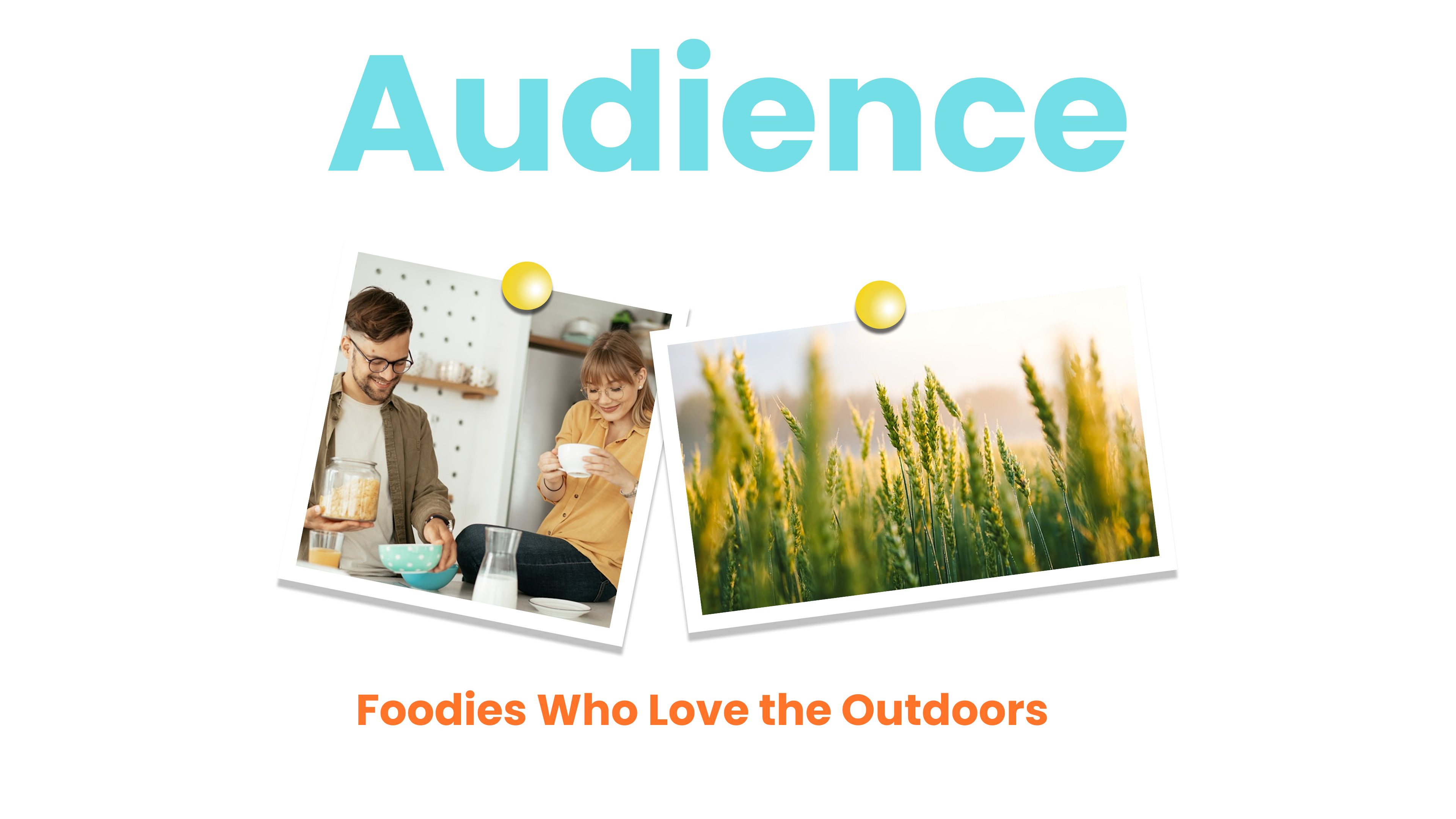
The audience I designed for values transparency, sustainability, and quality — farm-to-table culture without the pretension. They want a brand that feels like an invitation to the table, not a lecture from a shelf.
Brand
Defining the vibe
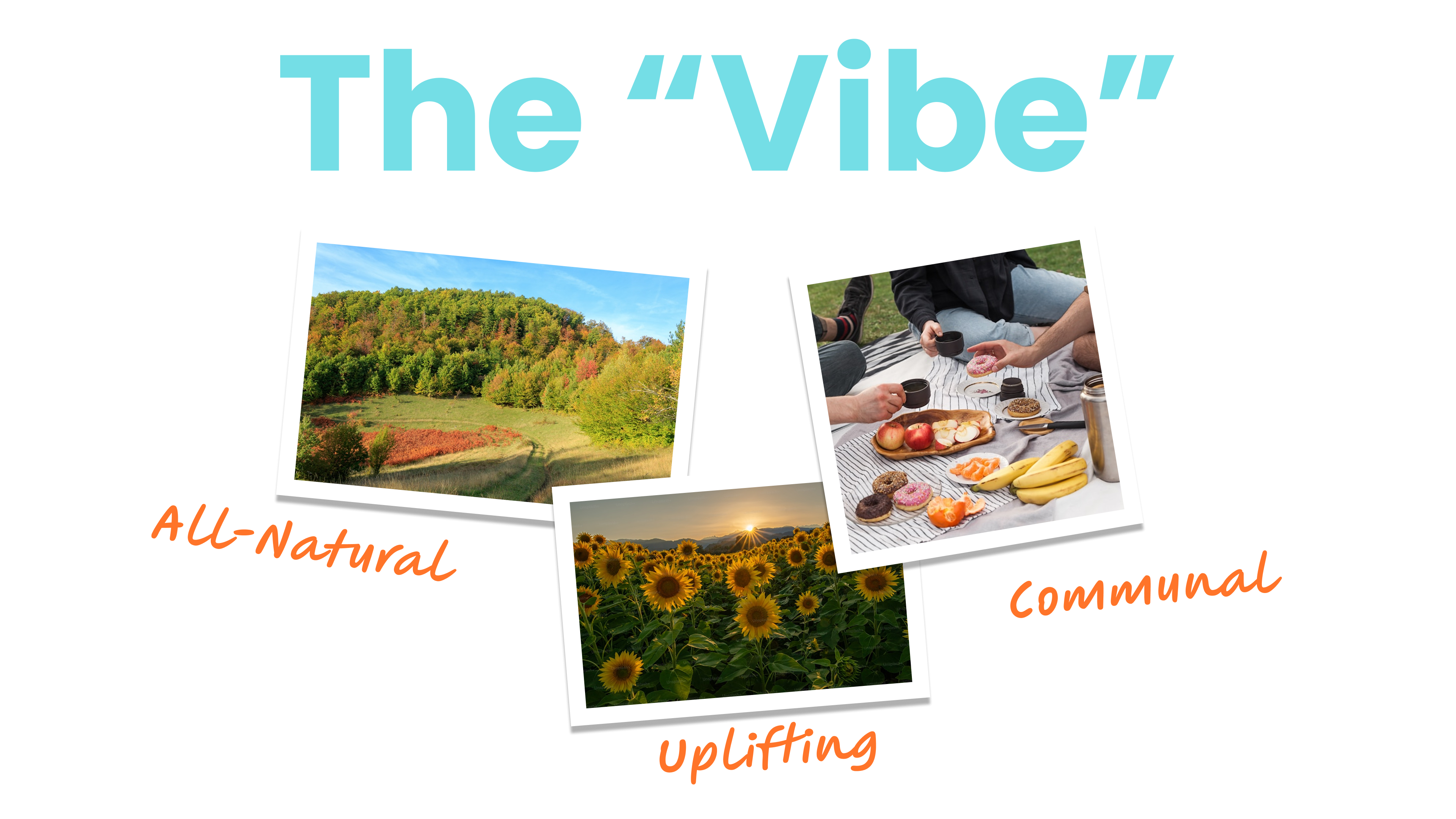
Three words became the filter: All-Natural, Uplifting, and Communal.
All-Natural is a visual language — organic textures, earth-born color, forms that aren't perfectly geometric. Uplifting means the brand should make you feel something — actually joyful, not just trustworthy. Communal means inviting you in: a family table, not a store shelf.
If it felt cold or corporate, it failed. If it felt generic-natural, it wasn't uplifting enough. Everything had to land in the overlap of all three.
Mood boards
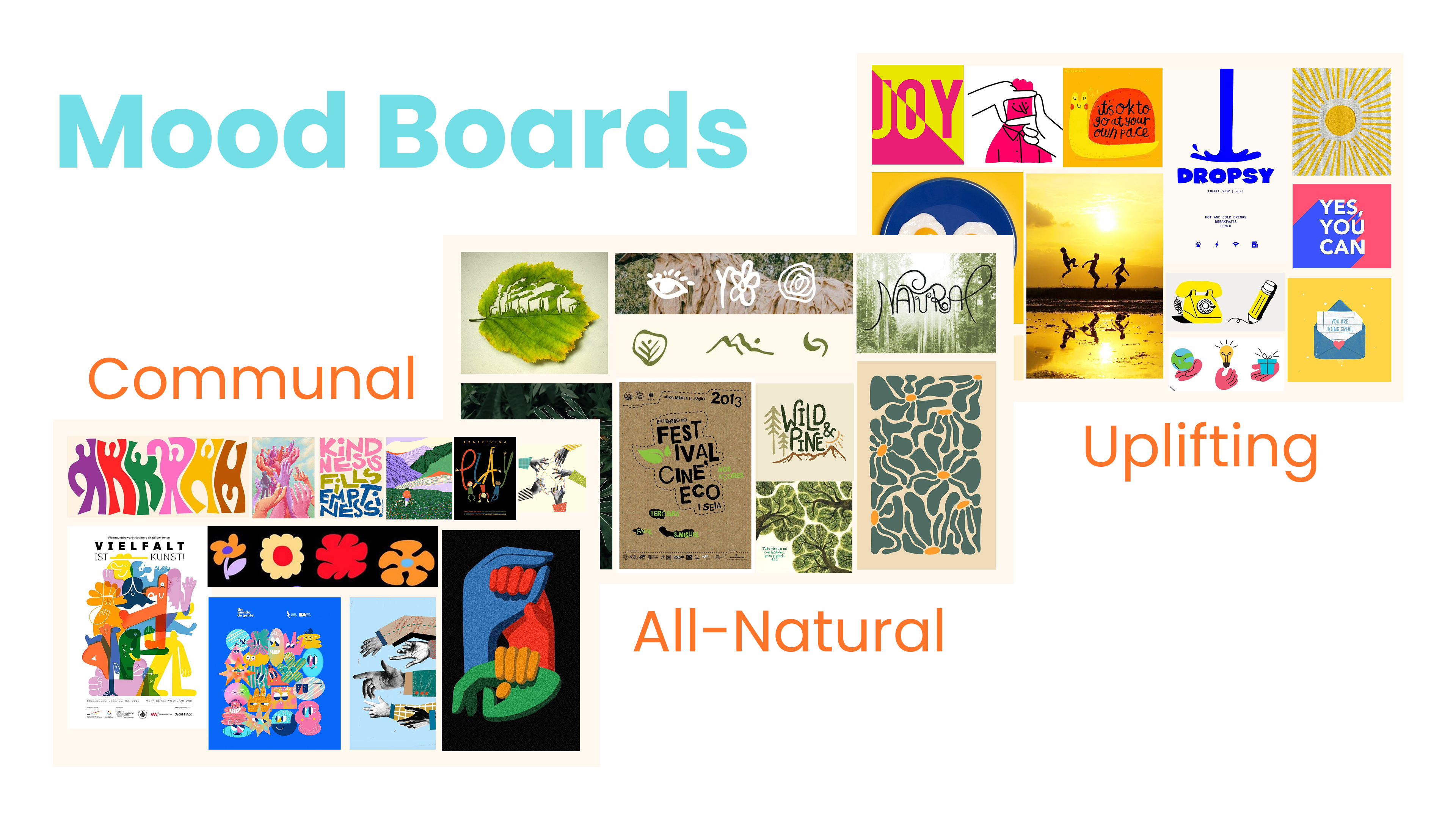
I built three boards — one per vibe word — pulling from folk art, community poster design, eco-design, botanical illustration, and bold joyful graphic work. Communal drew from people eating together outdoors. All-Natural from organic typography and botanical reference. Uplifting from the kind of design that makes you smile before you read it.
Where the three boards overlapped was where Dairy & Delight lived — and that territory informed every color, typeface, and illustration choice from here on.
Logo
100 sketches to one mark
I don't start in software — I start in a sketchbook and don't stop until I've explored enough angles to know which direction is right. For Dairy & Delight, that meant over 100 iterations before a single vector: logotypes, icons, literal and abstract marks, dairy and natural imagery, combinations I knew wouldn't work — because exhausting the obvious is how the interesting stuff shows up.
Two directions felt alive. A circular badge with a hand-drawn cow — warm, vintage, inviting. And a sun mark from alternating yellow and magenta rays, reading as both sun and the top of a dairy product. The sun won: bold at any scale, directly Uplifting, joyful without being precious.
Refinement & lockups
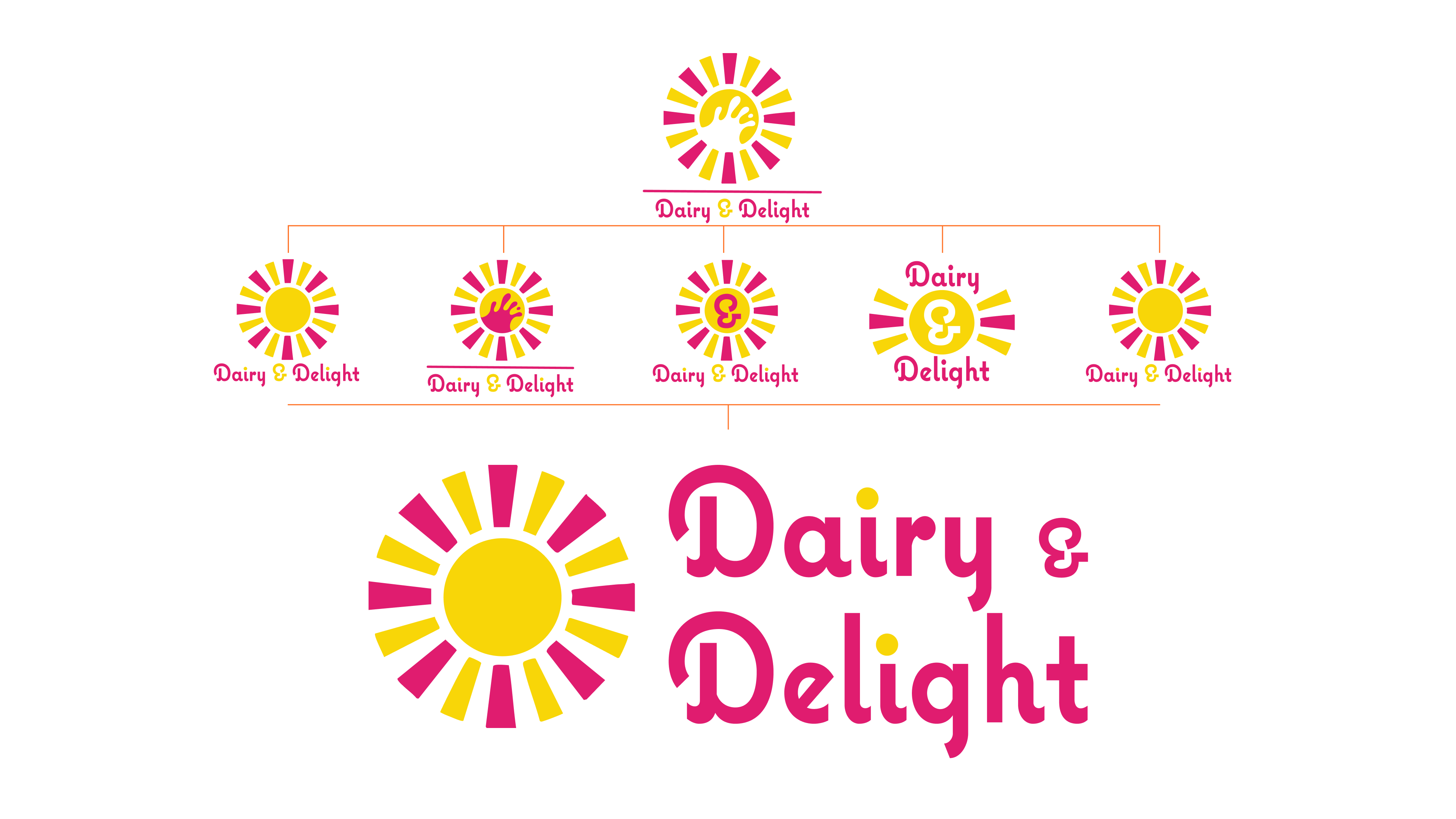
Multiple refinement rounds on ray count, proportions, yellow-magenta balance, and wordmark integration. The final system includes the core mark plus five lockups for different contexts.
The wordmark uses a rounded, slightly bouncy serif — warmth without childishness. The ampersand in 'Dairy & Delight' gets hand-lettered treatment. Every round was tested on a milk bottle, app icon, poster, and web header.
Brand system
Color, type & illustration
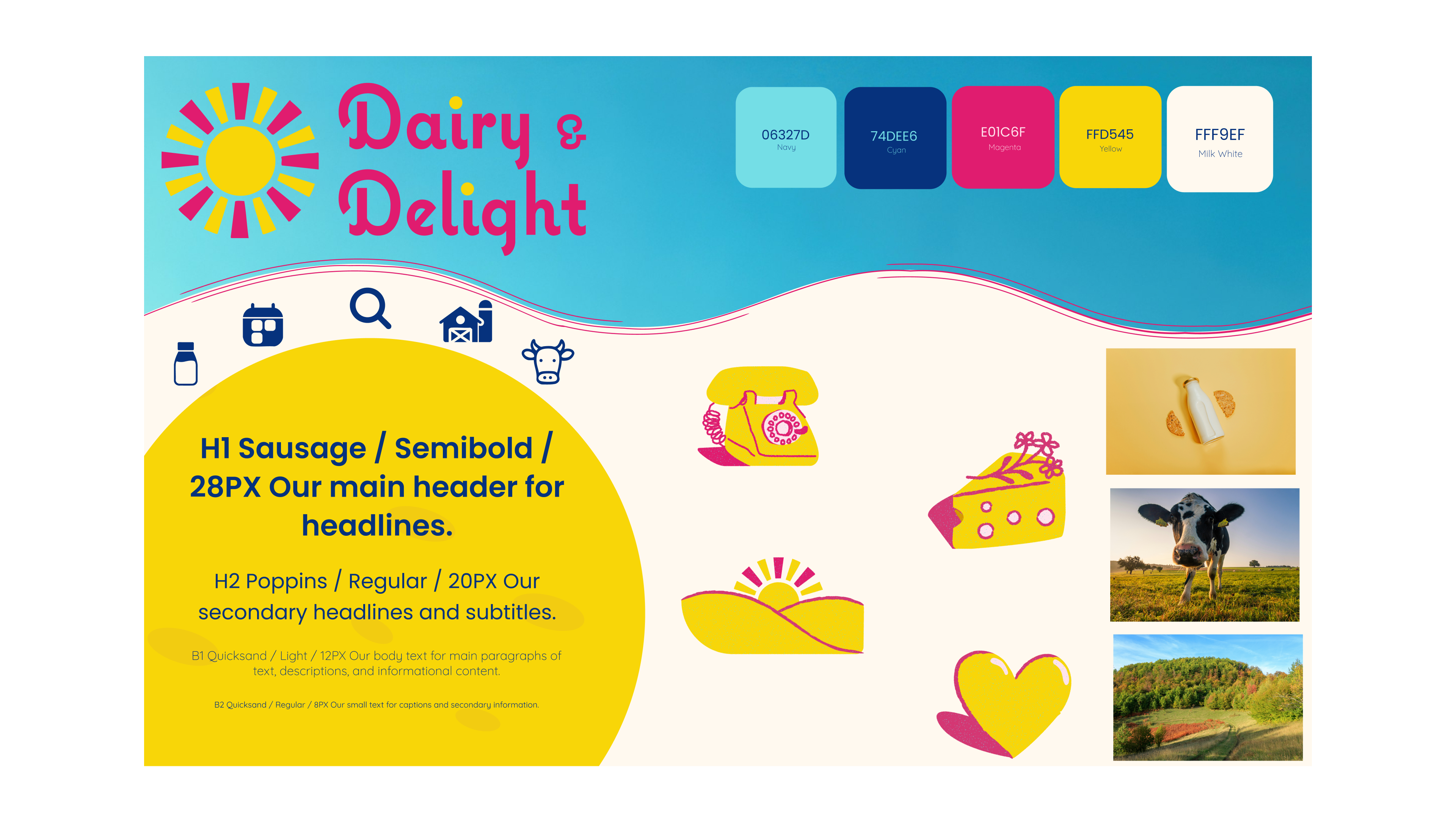
Five colors, each doing specific work: Navy (#06327D) anchors legibility. Cyan (#74DEE6) is air, outdoors, morning light. Magenta (#E01C6F) carries energy and personality. Yellow (#FFD545) is warmth, sunlight, butter, cheese. Milk White (#FFF9EF) is the canvas — warm, never sterile.
Headlines: Sausage Semibold — chunky, friendly, retro joy. Secondary: Poppins Regular. Body: Quicksand Light — airy and legible.
The illustration system — rotary phone, cheese wedge, sunrise, heart — uses Yellow and Magenta two-color pairings so assets read instantly as Dairy & Delight. Playful without cartoonish; built for a kitchen wall or picnic blanket.
Three touchpoints, one voice

With the system set, I designed three touchpoints: a print poster, a mobile app, and a landing page. Each serves a different format and purpose — but everything had to feel unmistakably like the same brand across contexts. That consistency across wildly different media is one of the harder problems in brand design.
Design
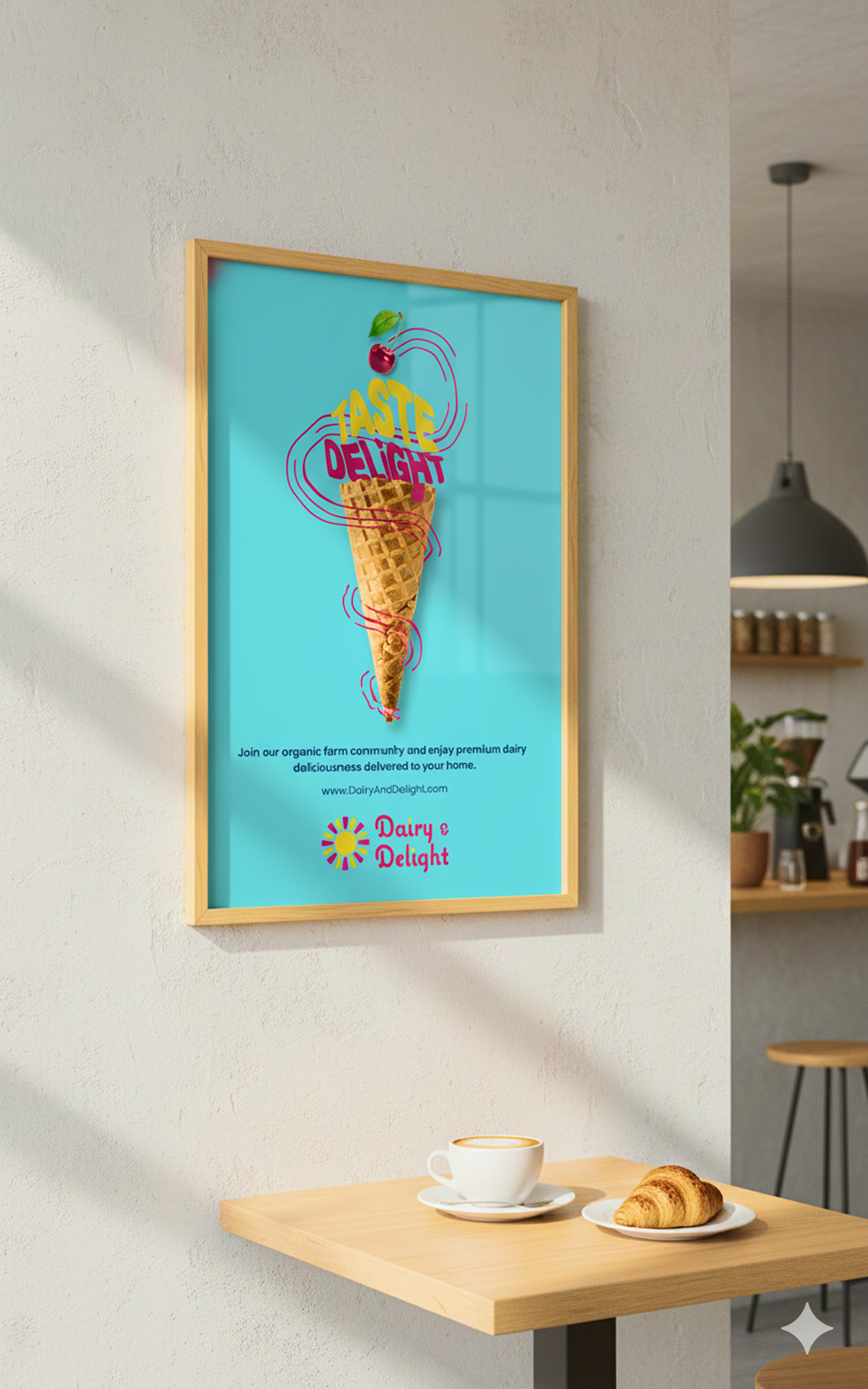
The poster
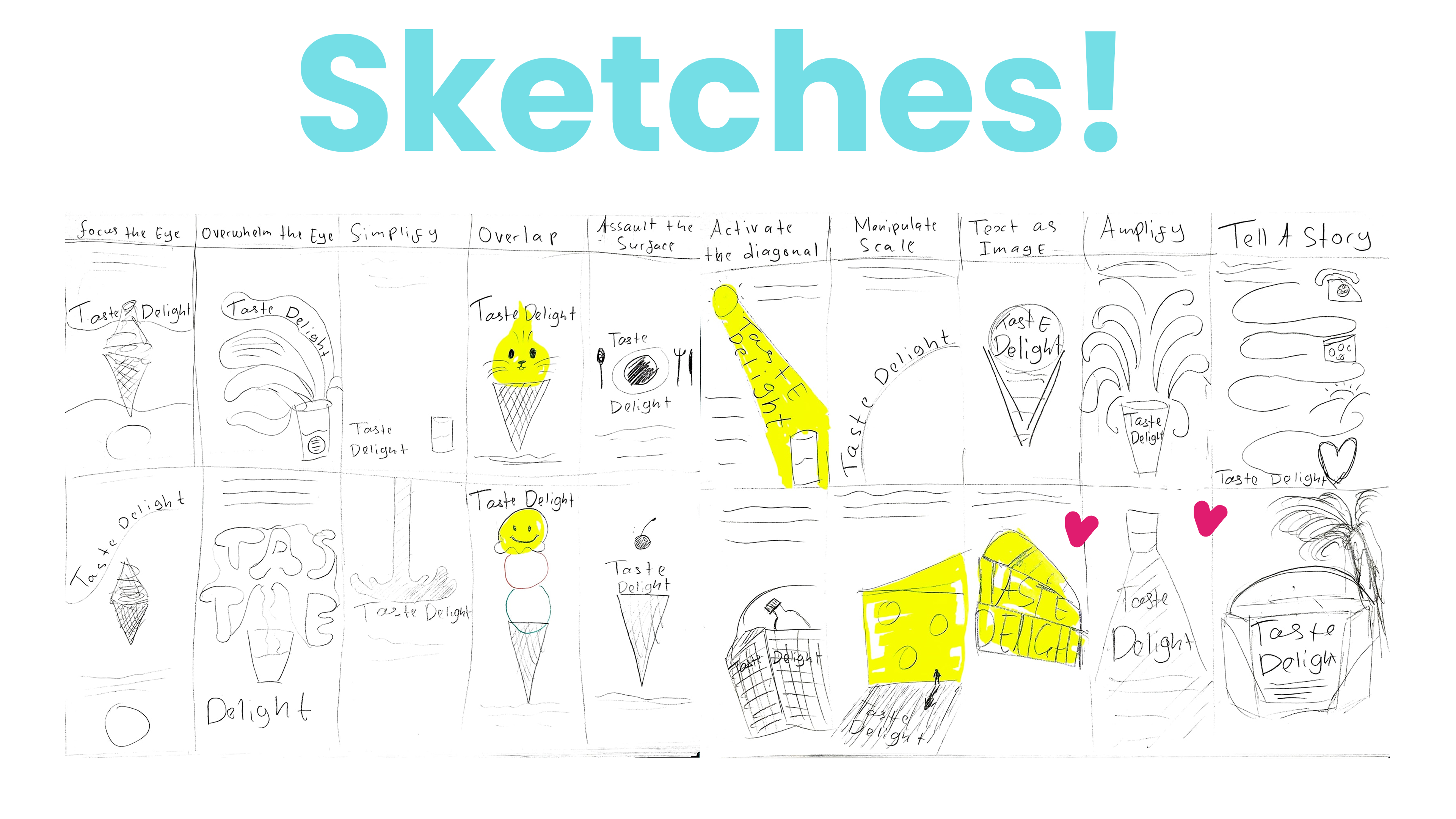
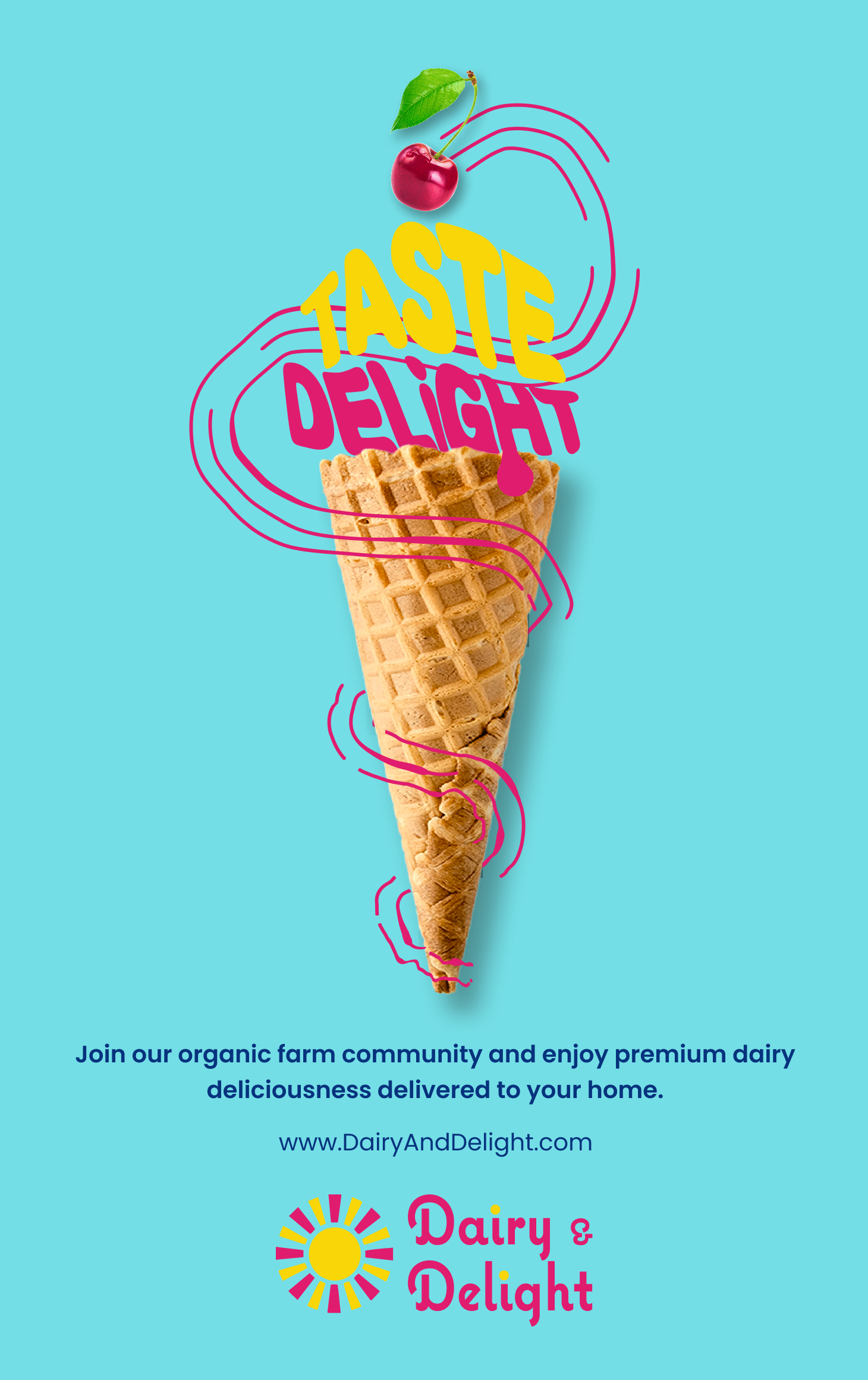
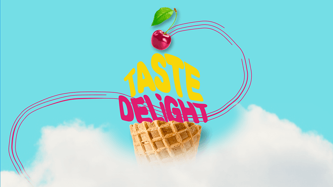
The poster went through the most exploration. In class I applied ten visual principles to the same brief — Focus the Eye, Overwhelm, Simplify, Overlap, Assault the Surface, Activate the Diagonal, Manipulate Scale, Text as Image, Amplify, Tell a Story — two iterations each, twenty concepts by hand.
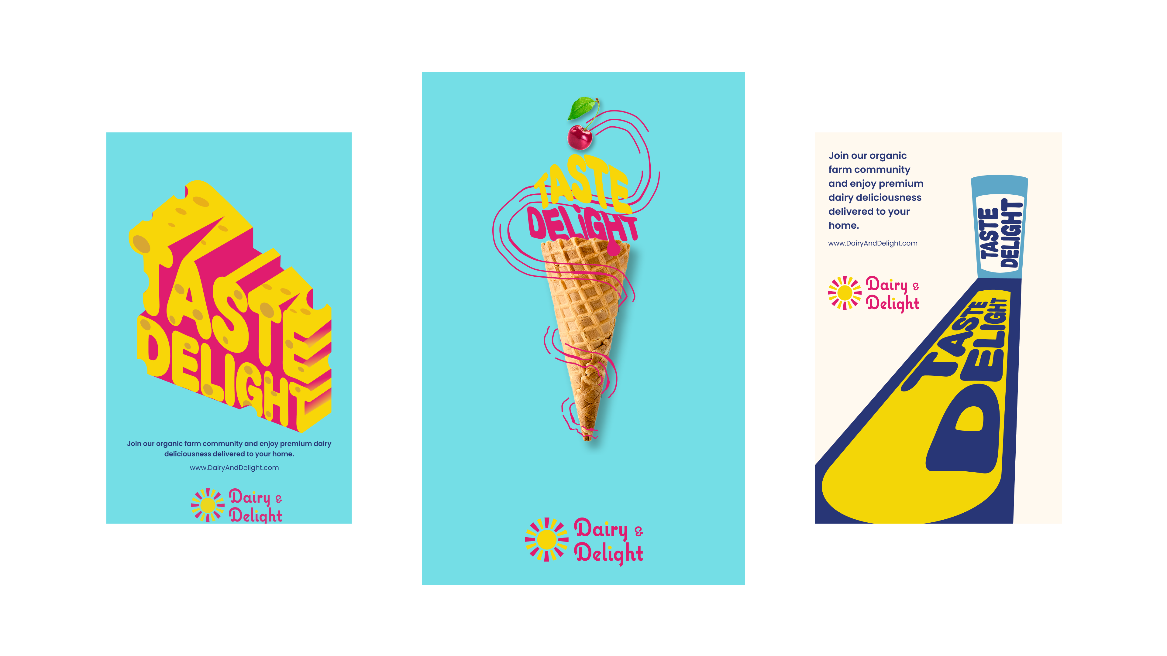
The principle I kept returning to was Text as Image: words becoming the visual — 'Taste Delight' as 3D Swiss cheese, or wrapping a spiraling ice cream cone. The final poster I'm most proud of: a waffle cone with a cherry on top, 'TASTE DELIGHT' in Magenta following the spiral. Typography animates the object. Joy before you've read a word.
Landing page
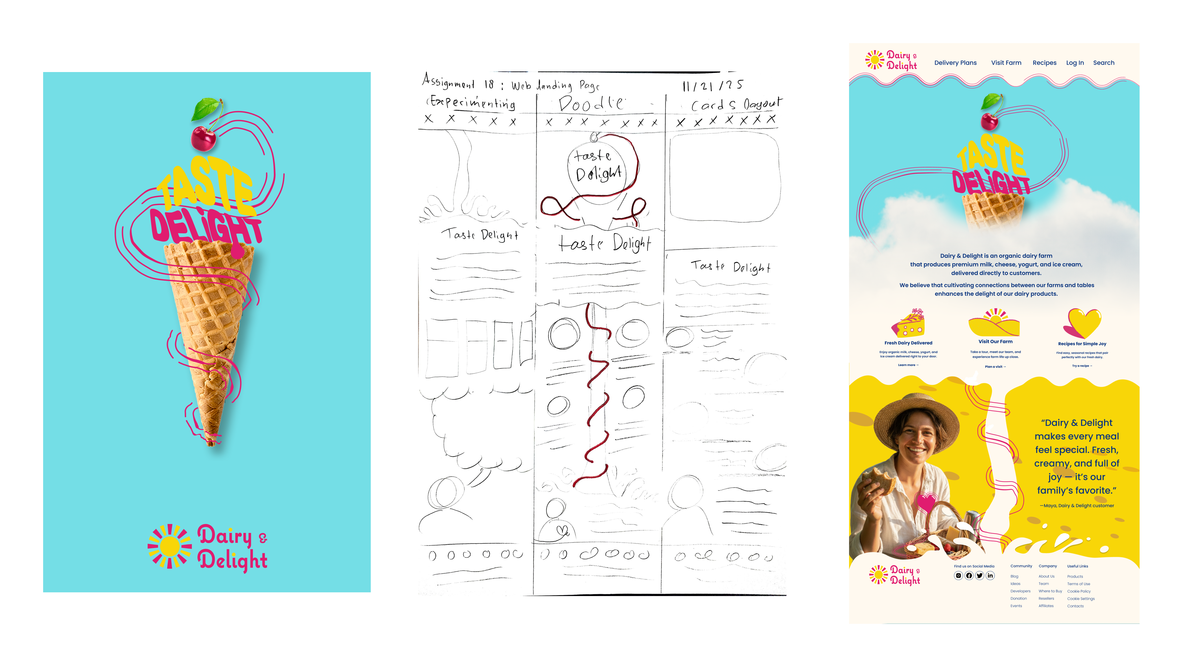
Translating brand energy to the web without flattening it. I sketched three layout directions before committing. The final blends doodle warmth with a cards layout: clean grid, wavy brand border, illustrations anchoring each feature section.
Hero leads with the ice cream cone poster — double duty as brand hero. Three pillars below: Fresh Dairy Delivered, Visit Our Farm, Recipes for Simple Joy. Testimonial on yellow wave. Footer grounded in Navy.
Mobile app
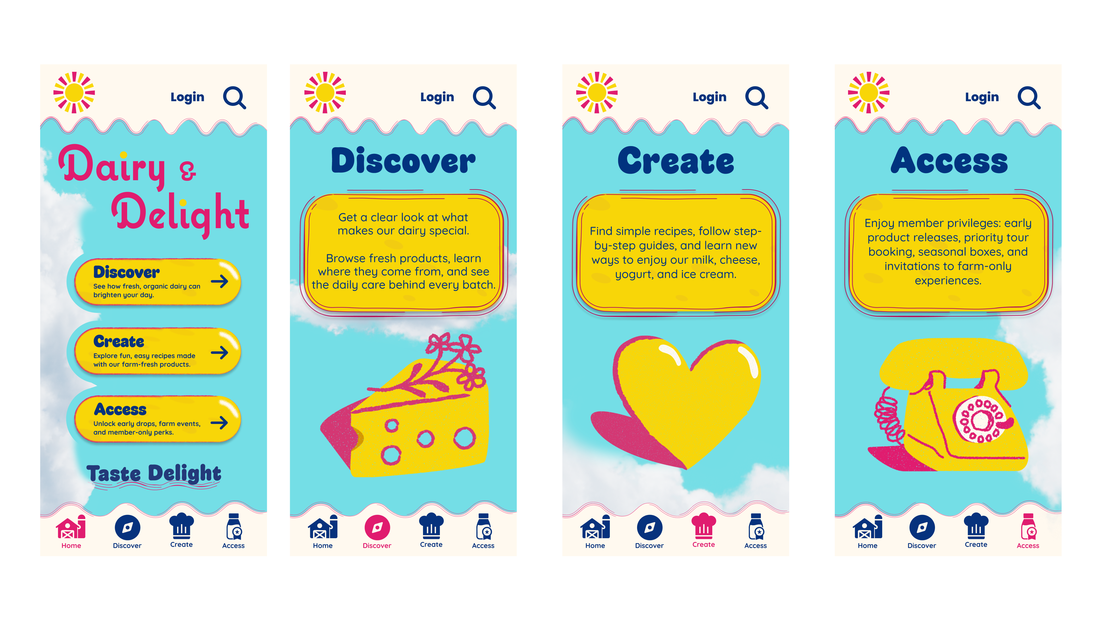
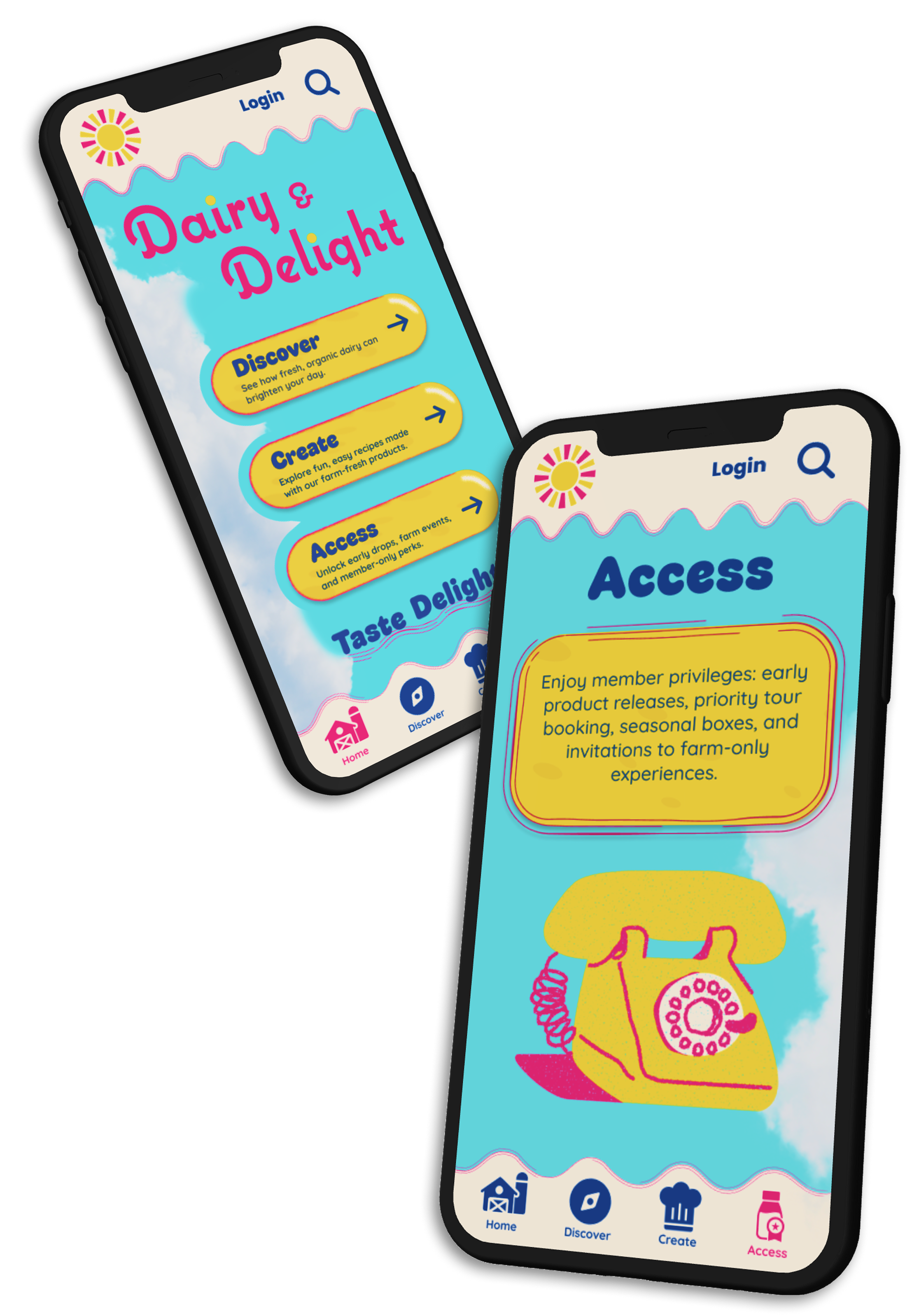
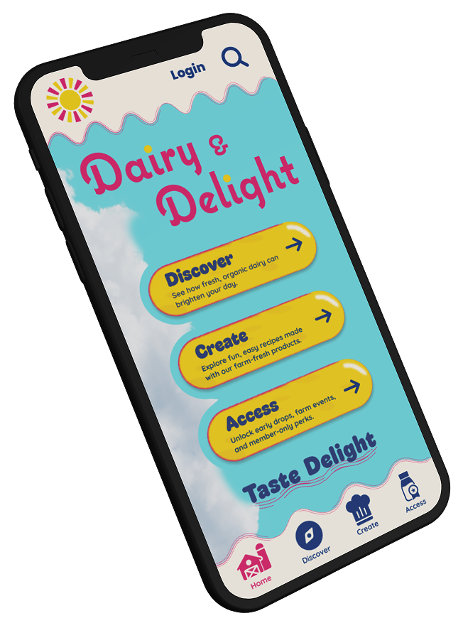
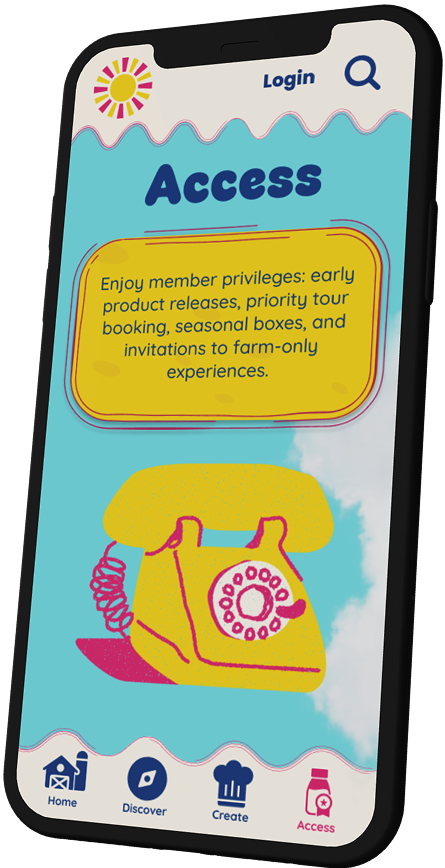
Three core sections: Discover (products and farm process), Create (recipes and guides using Dairy & Delight products), and Access (member privileges — early releases, farm tours, seasonal boxes).
Natural progression: discover the brand, engage through cooking, deepen through membership. Sky-blue home with cloud quality, large pill CTAs, full-bleed illustrations per section, wavy header border tying app to web and poster.
Final deliverable
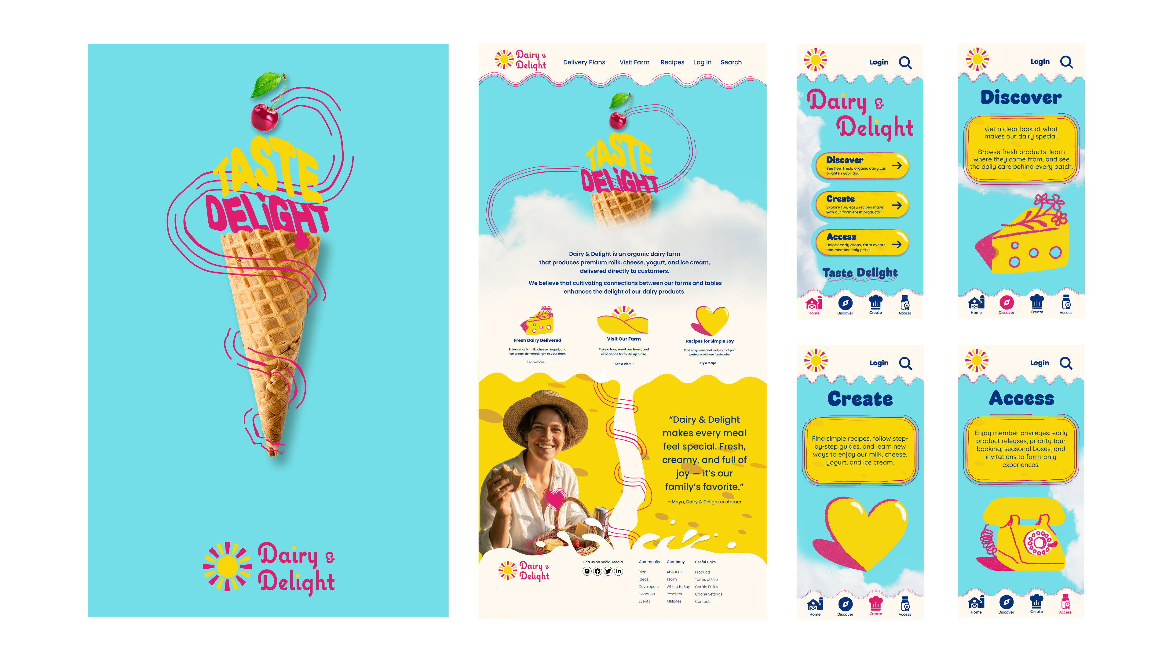
Poster, landing page, and app together — one visual voice from print to pocket. The system holds because the emotional filter was set before the first pixel: all-natural, uplifting, communal.
Reflection
This was my first serious brand design project — and where my fine arts training showed up in practice. Color theory isn't palette picking; it's emotional weight, relationships between hues, harmony and tension as tools. The poster is what I'm most proud of: not because it's the most structurally complex piece, but because you look at it and feel the joy of ice cream. That's the goal — not to describe the product, but to make you feel it. Next I'd design the packaging system — milk bottle, cheese wrapper, ice cream pint — the illustration system is already built for it.