Dairy & Delight
Dairy & Delight is a brand and digital experience designed for an organic dairy farm that delivers fresh milk, cheese, yogurt, and ice cream directly to consumers. The project focused on building a cohesive brand identity and multi-platform experience that communicates the farm’s values of natural food, community, and transparency.

Project Overview
Client: Academic UX Project (Brand Experience)
Industry: Organic Food / Direct-to-Consumer Dairy
Timeline: 3 Weeks
My Role: Brand & UX Designer
Dairy & Delight is an organic dairy farm brand focused on delivering fresh milk, cheese, yogurt, and ice cream directly to consumers. The challenge was to create a brand identity and digital ecosystem that communicates the farm’s values—natural food, community, and connection to the land—while appealing to food-focused consumers who enjoy outdoor lifestyles and farm-to-table culture.
The project involved designing a cohesive brand system and experience across multiple touchpoints, including marketing posters, a landing page, and a mobile app. The goal was to create an uplifting, communal, and all-natural brand presence that strengthens the relationship between the farm and its customers while encouraging engagement with products, recipes, and farm experiences.
Process Work

The primary audience consists of food-focused consumers who value fresh ingredients, outdoor lifestyles, and farm-to-table culture. These users are interested in knowing where their food comes from and prefer products that emphasize transparency, sustainability, and quality.
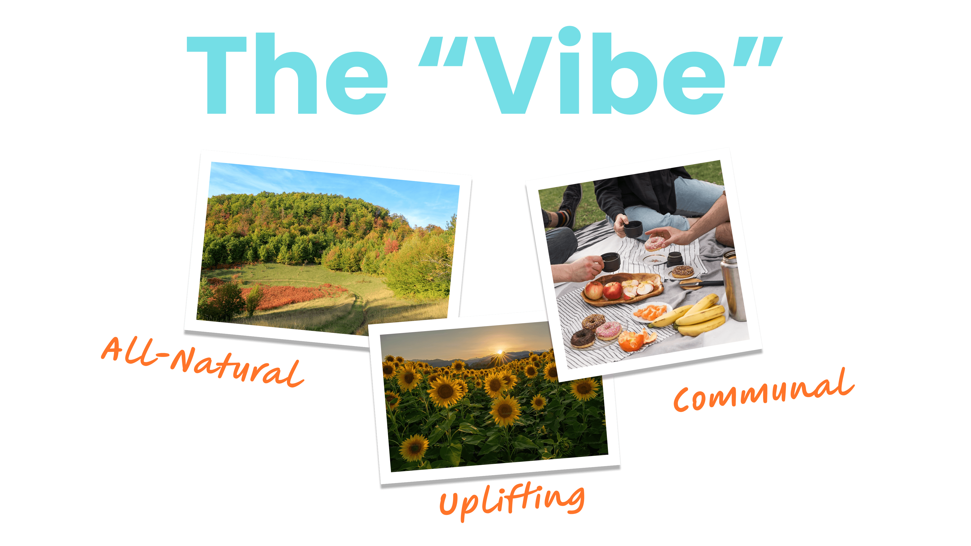
The visual and emotional direction of the brand was defined through three core attributes: all-natural, uplifting, and communal. The brand experience is intended to feel welcoming and energetic while reinforcing the authenticity of organic farming.
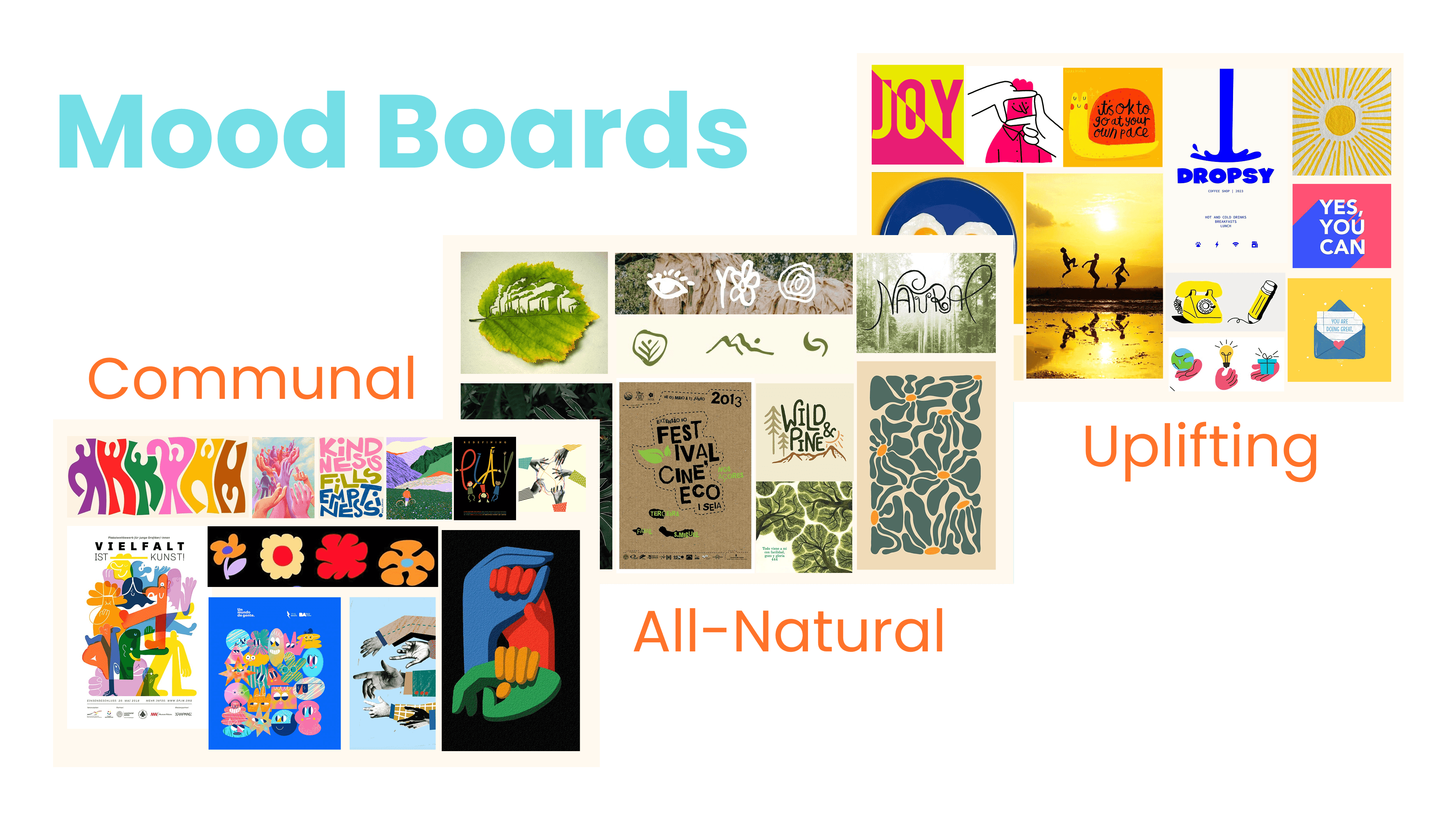
Mood boards were developed to explore visual inspiration tied to nature, community, and organic agriculture. These references helped establish the tone of the brand and informed decisions around color, typography, and imagery.
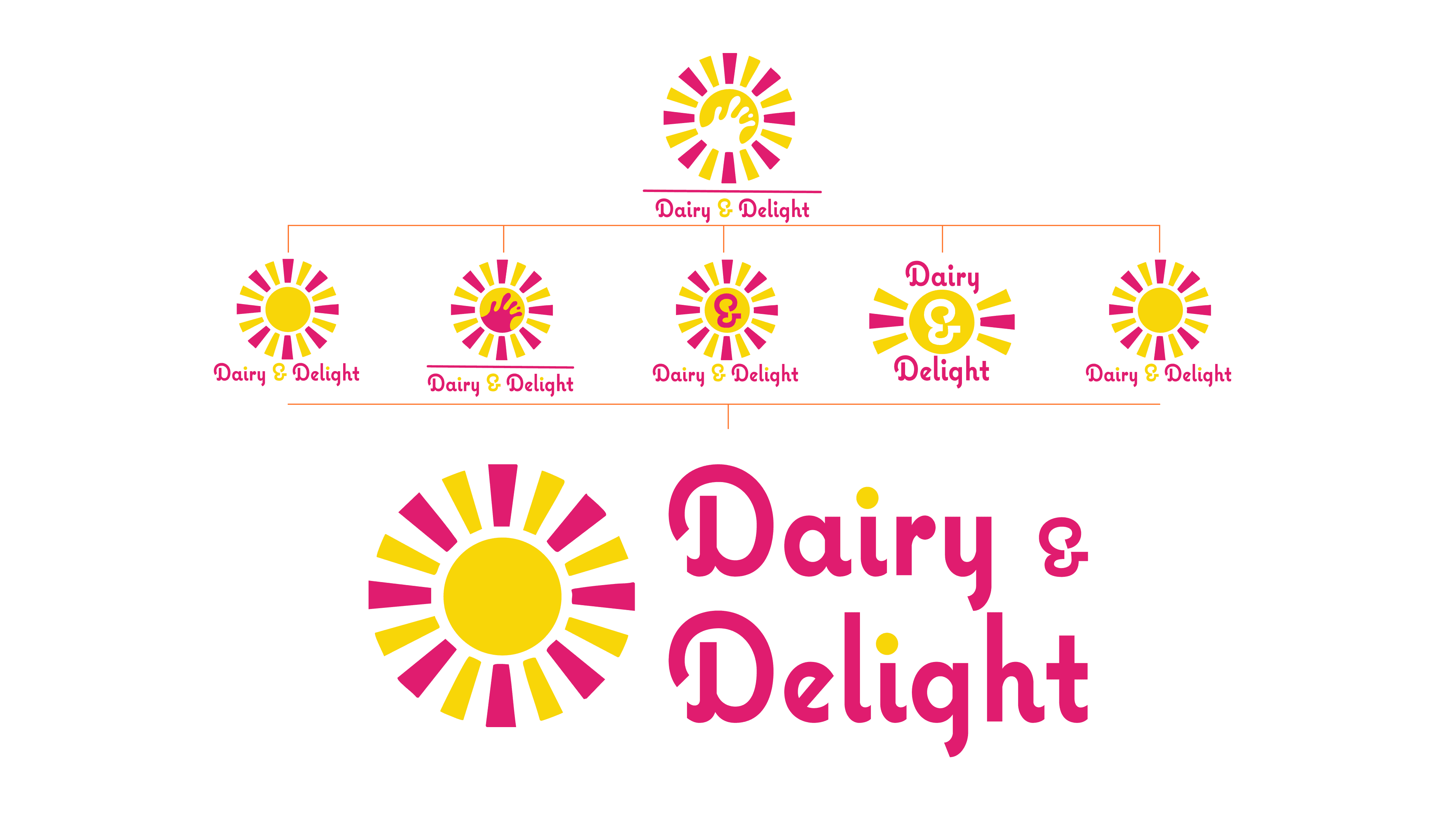
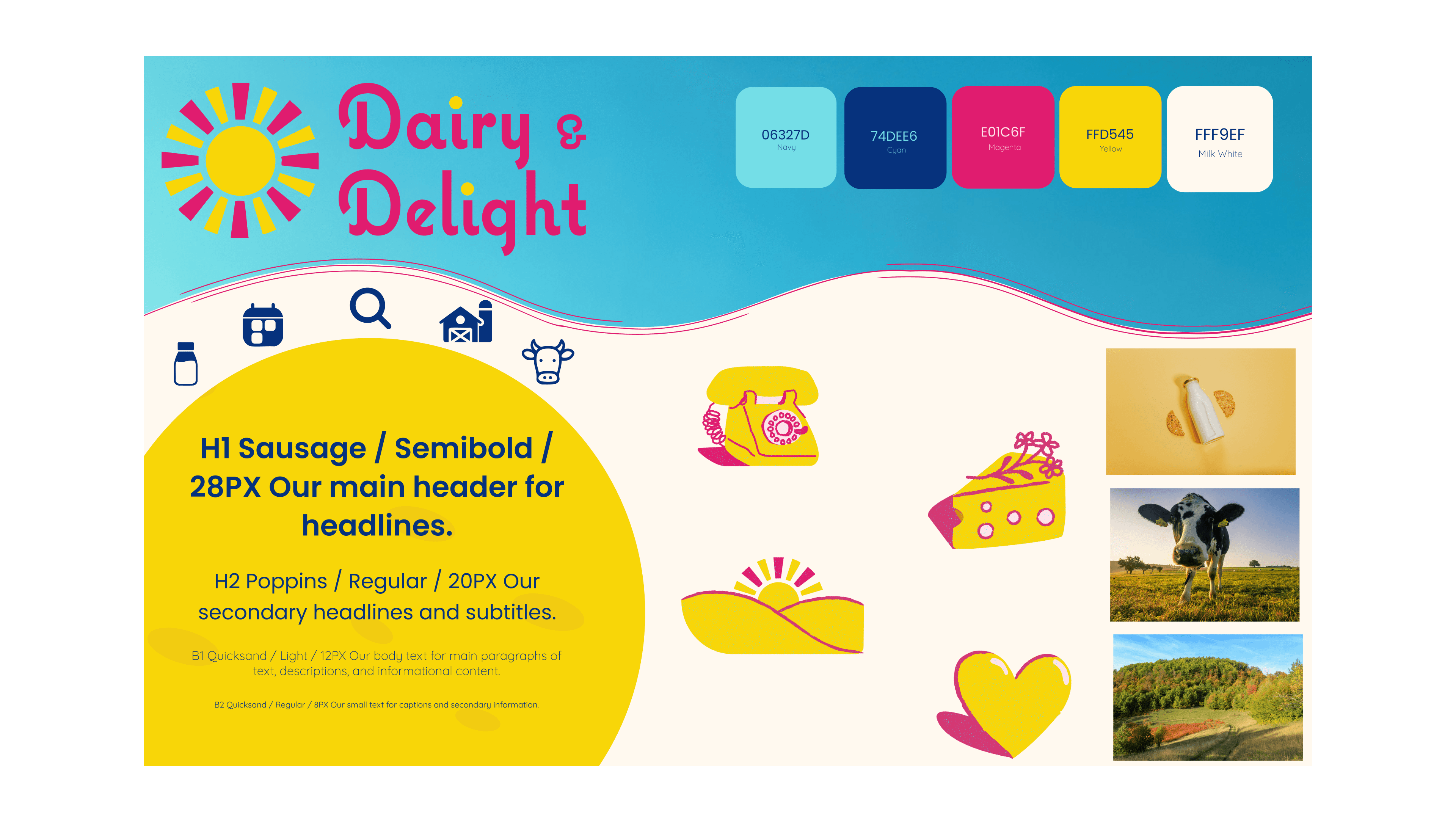
The color palette uses warm yellow and milk white as primary colors to evoke freshness, sunlight, and dairy products. Cyan, magenta, and navy are used as accent tones to introduce visual contrast and energy across digital and print materials.
Touch Points:
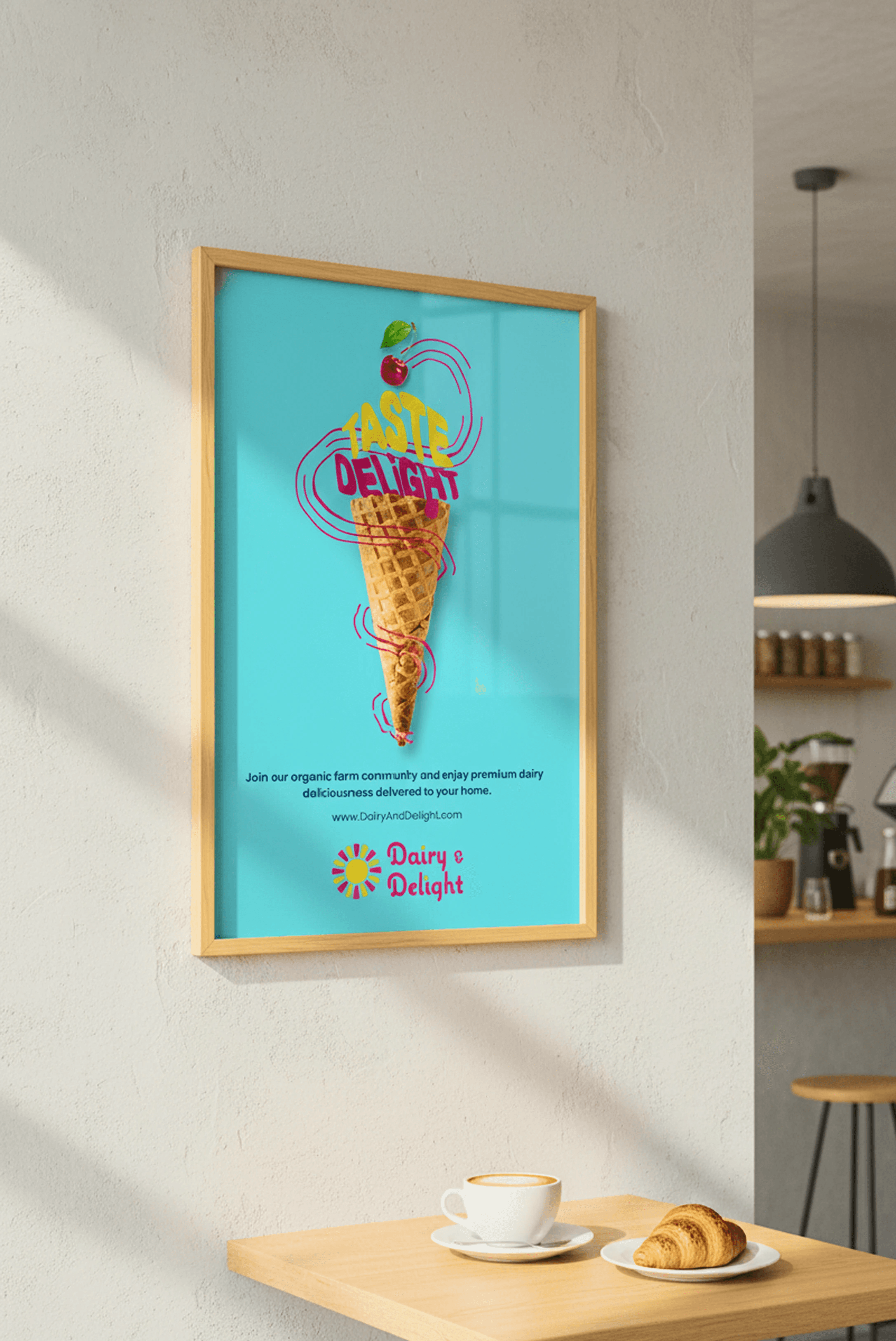
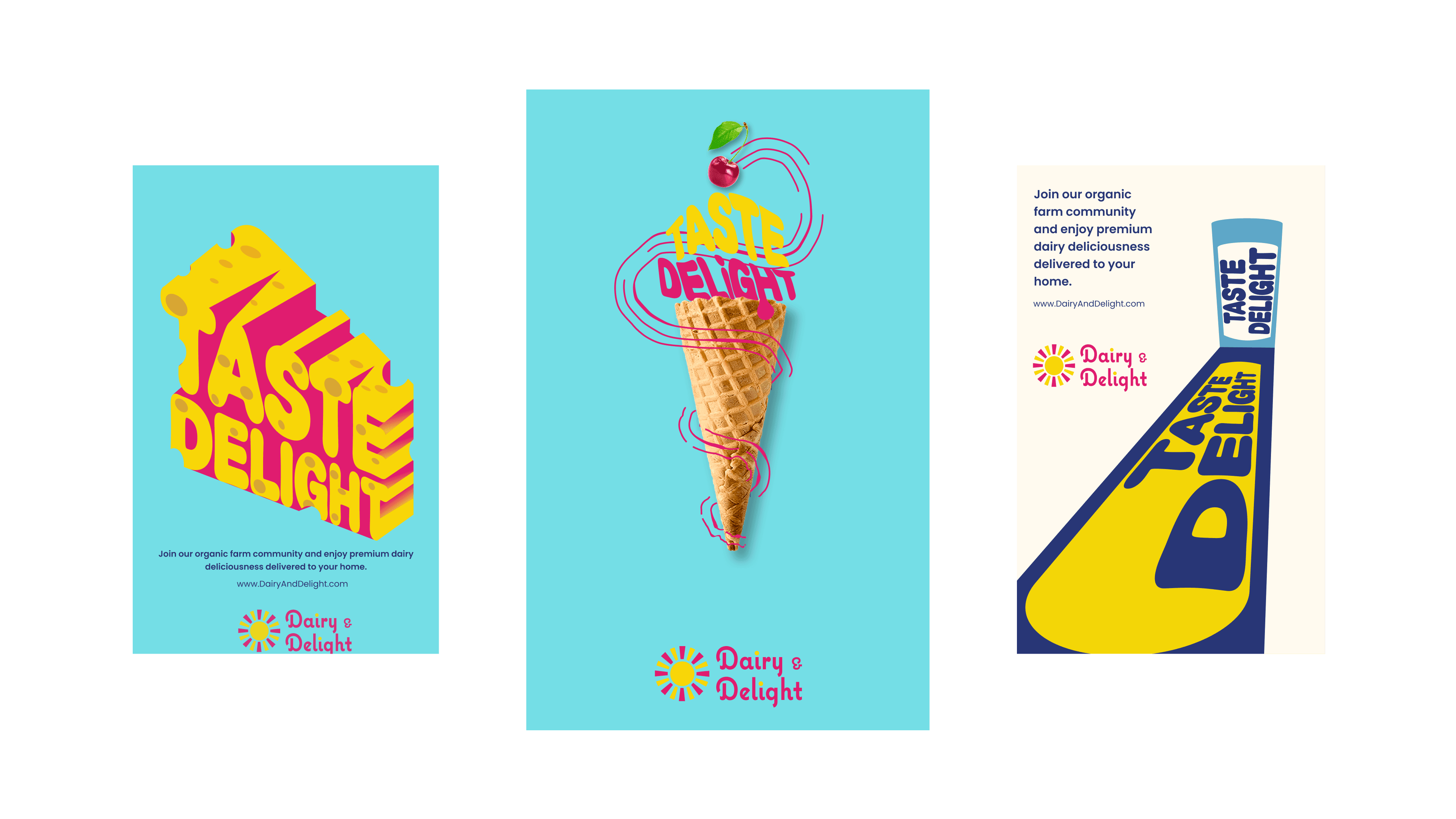
The brand experience extends across multiple platforms including posters, a marketing landing page, and a mobile app. Each touchpoint reinforces the same visual identity while serving different functions—promotion, product discovery, and community engagement.
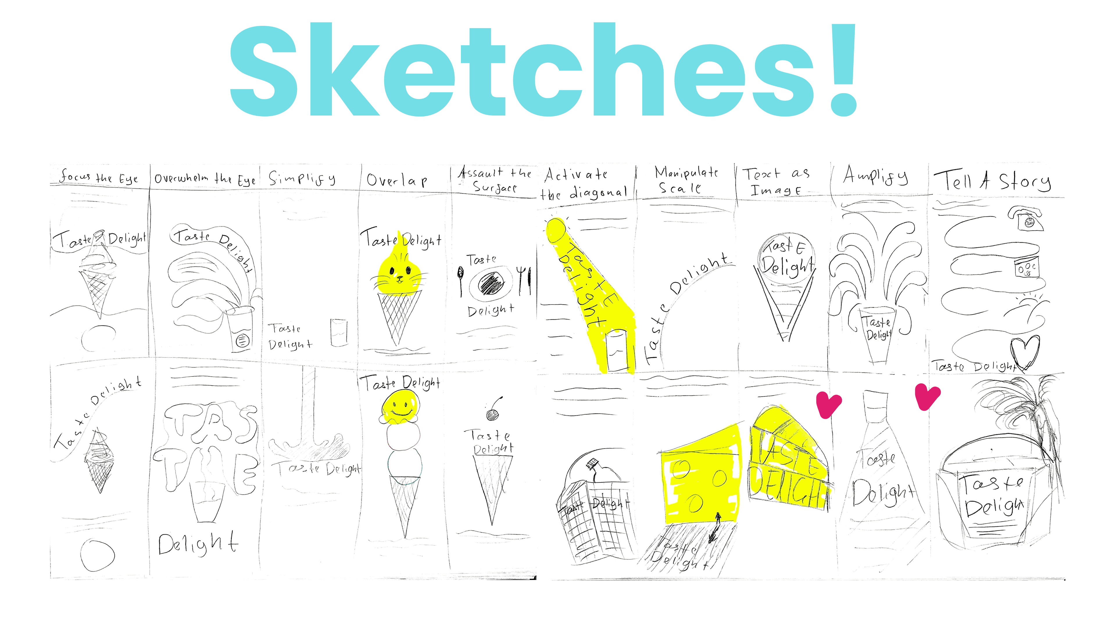
Initial sketches explored layout structures and communication strategies for both print and digital interfaces. These rough concepts allowed rapid iteration before moving into refined digital designs.
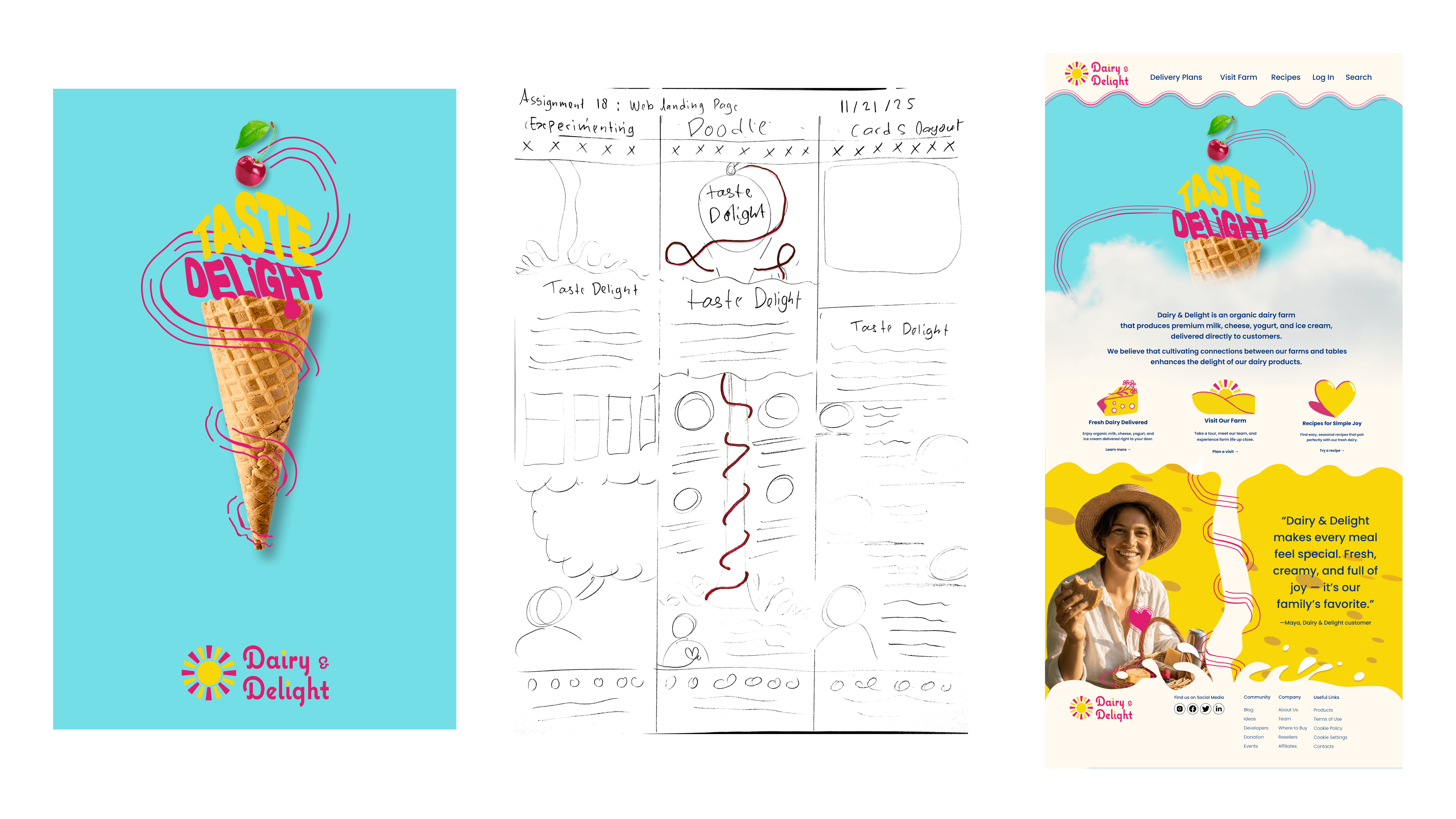
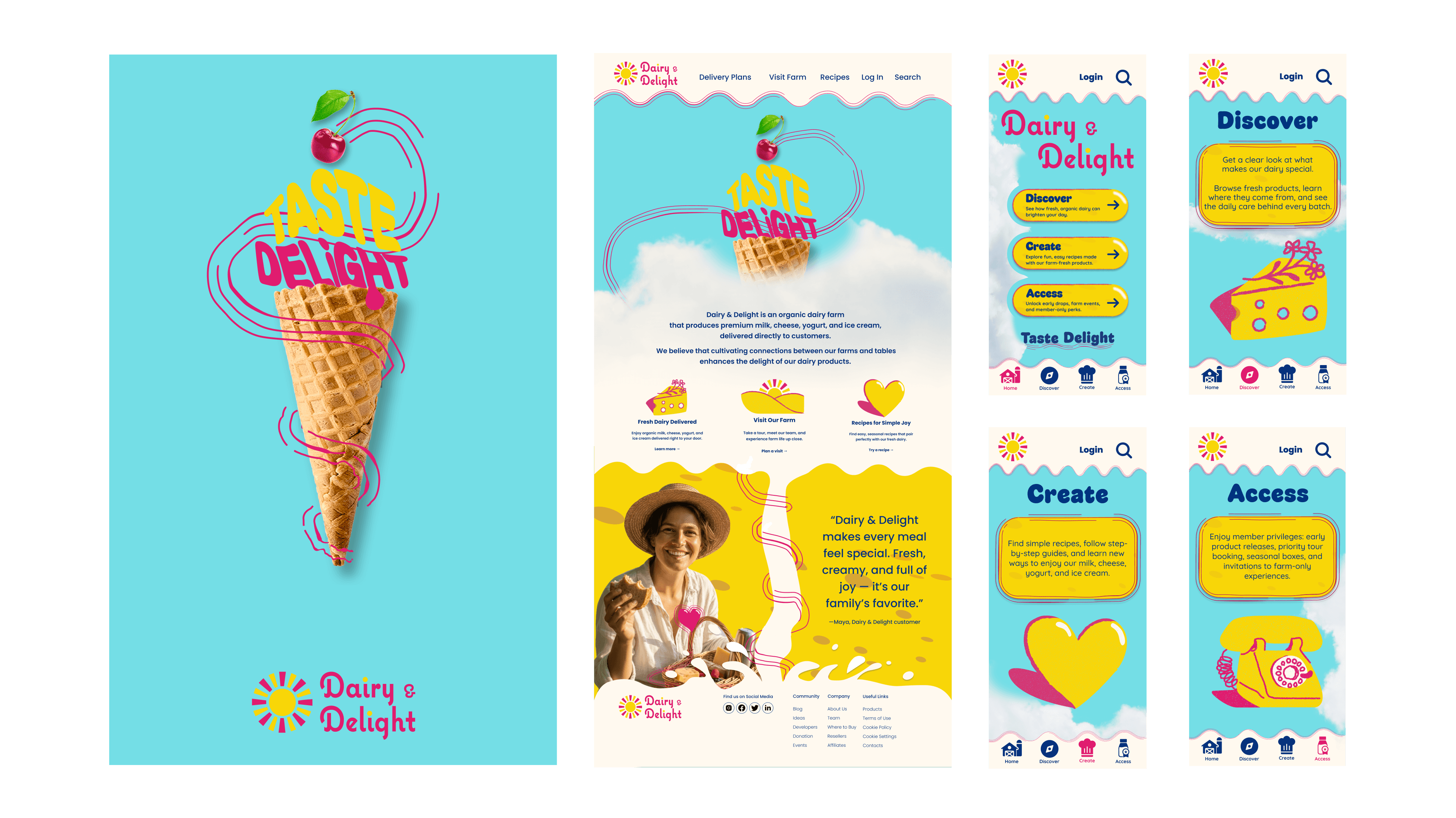
The landing page introduces the brand and communicates the core offerings of Dairy & Delight. Key sections highlight product delivery, recipes, and farm visits, guiding users through the brand story while encouraging deeper engagement.
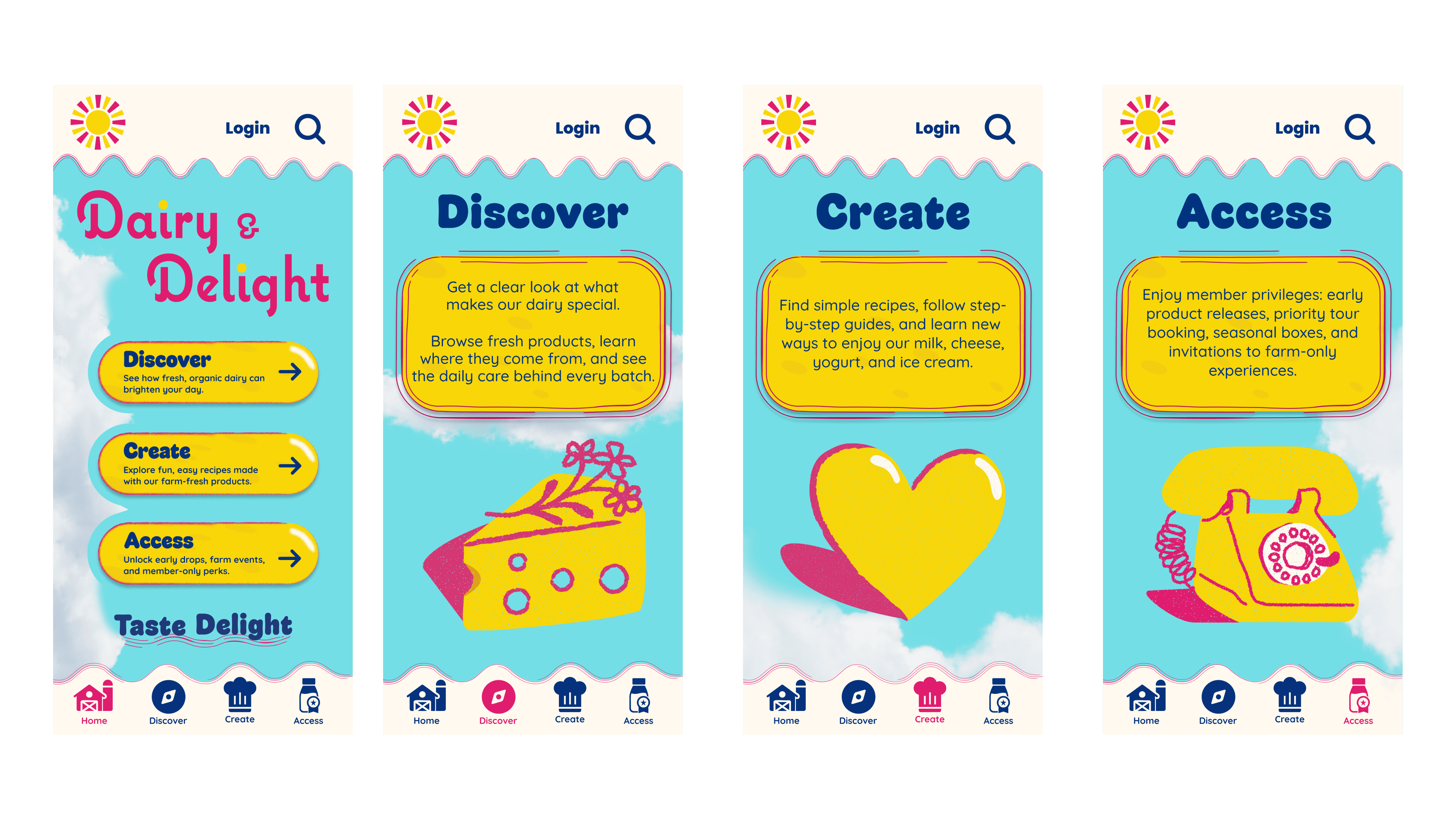
The mobile interface extends the brand ecosystem by allowing users to browse products, access recipes, and unlock member benefits directly from their phones. The design prioritizes clarity and ease of navigation while maintaining the brand’s playful, uplifting tone.
Thank You