
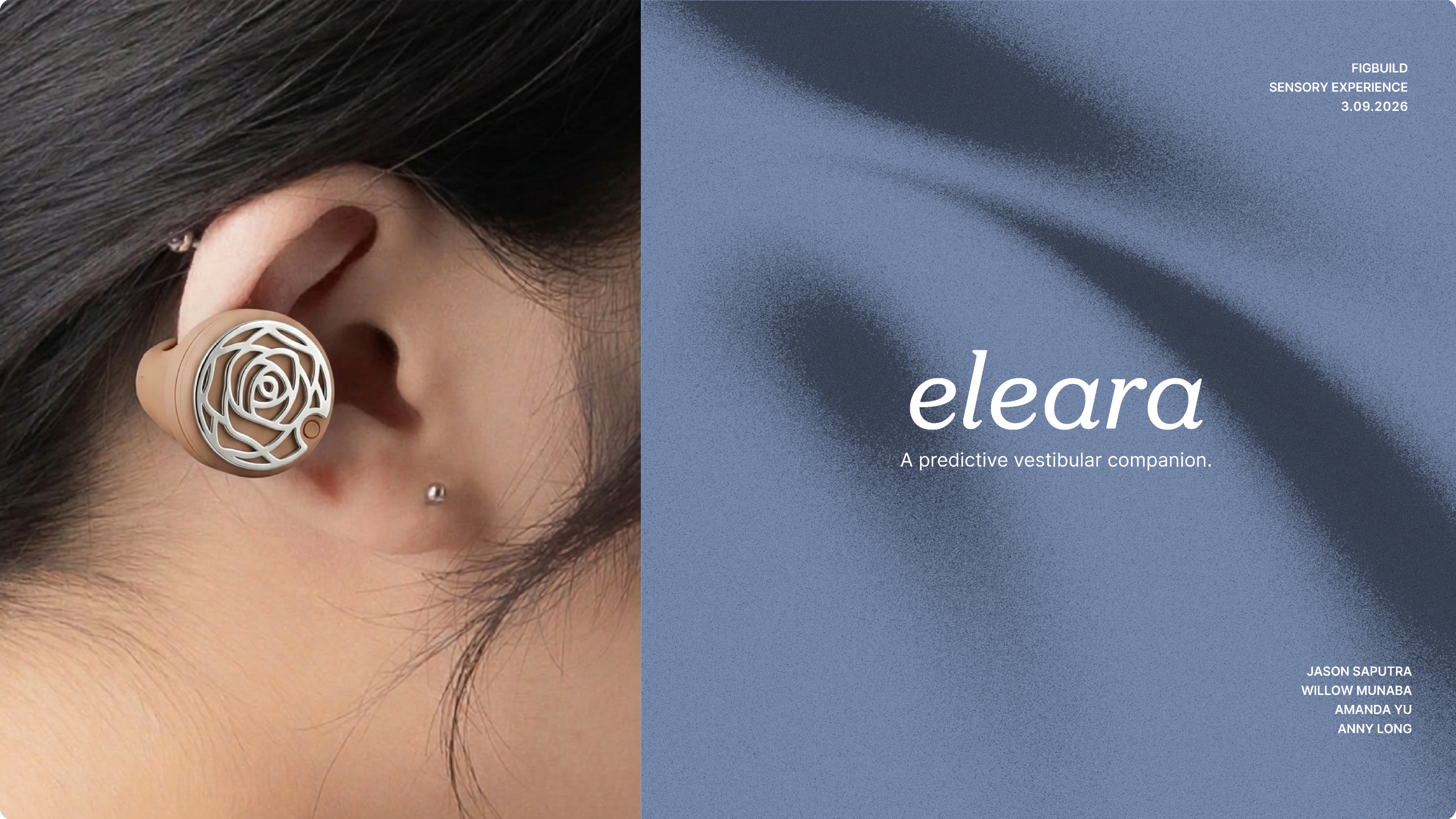
Eleara
A predictive vestibular companion.
- UX Design
- Product Design
- Systems Design
- Team Lead
A wearable + app that uses galvanic vestibular stimulation to counter dizziness — built in a 72-hour remote sprint with user testing at hour 36.
Eleara is a predictive vestibular companion — a wearable plus app that uses galvanic vestibular stimulation to counter dizziness before episodes escalate, and alerts emergency contacts when they do.
Built in 72 hours over Zoom with Willow Munaba, Amanda Yu, and Anny Long. I led process and contributed the user flow; every concept decision was collective, but keeping us moving was on me.
Project Overview
Client
FigBuild Hackathon · Team of 4
Industry
Health UX · Wearables
Timeline
72 hours · Remote sprint
My role
PM / UX Lead — process, user flow, feedback synthesis
The constraint
Zero to research-backed, user-tested prototype in 72 hours — remotely.
My contribution
Sprint facilitation, PRD alignment, user flow architecture, and Day 2 feedback synthesis.
Key design call
Hold-to-trigger emergency button — prevents false SOS alerts without slowing real emergencies.
What we'd validate next
Whether GVS threshold calibration is intuitive for users during an active episode.
The sprint
72 hours, four people, one product
FigBuild is a design sprint where teams go from zero to a functional prototype in three days. Our team of four worked remotely over Zoom — coordination overhead most in-person teams never face.
My role was product manager and process lead. I didn't dictate the concept — ideas came from the team. I set daily agendas, ran structured ideation, delegated by strength, unblocked whoever was stuck, and made schedule calls when time slipped.
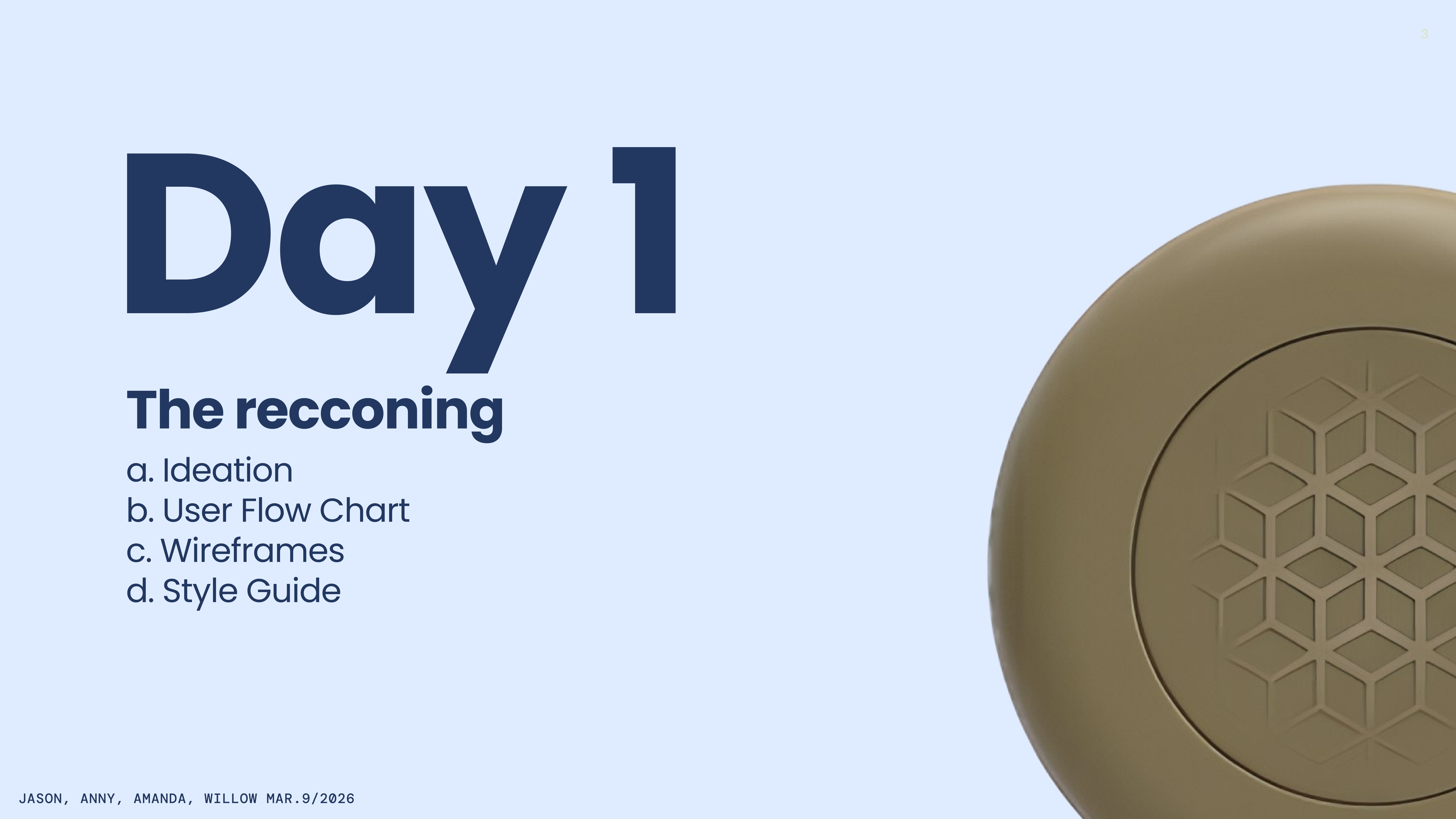
Day 1: ideation, PRD, user flow, wireframes, style guide. Day 2: first draft, user testing, iteration. Day 3: final screens, prototype recording, submission.
Day 1
Brainstorming
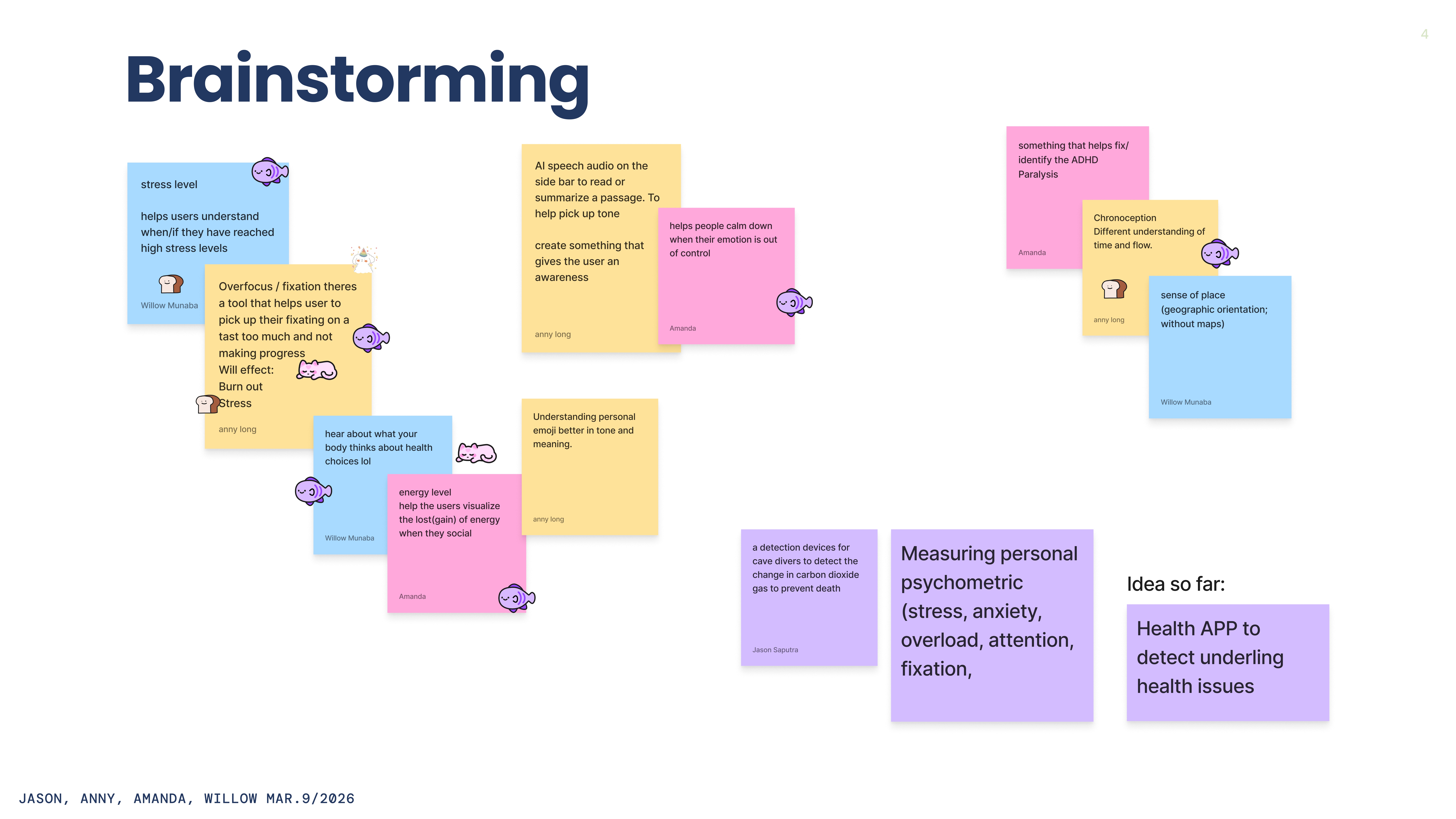
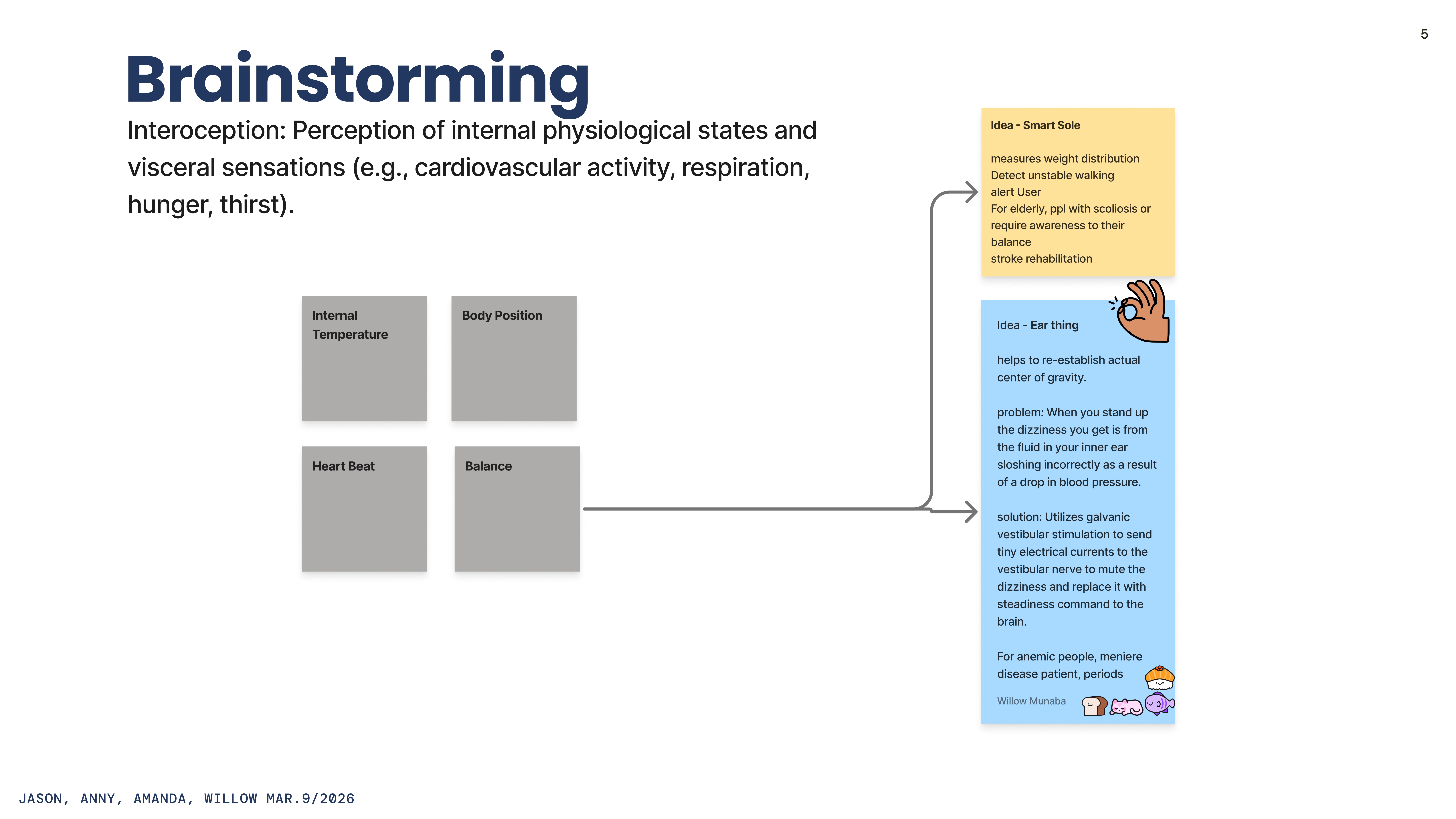
Day 1 opened with a timed sticky-note sprint — 15 minutes, no filtering. Ideas ranged from ADHD fixation tools to chronoception tracking to a cave-diving-inspired CO₂ monitor for interoception.
The shared instinct: work in the body's hidden signals, not surface metrics. That narrowed us to interoception — internal states including balance. Two concepts emerged: a Smart Sole for gait instability, and an ear-worn device using galvanic vestibular stimulation to counter vestibular mismatch. The Ear Thing won.
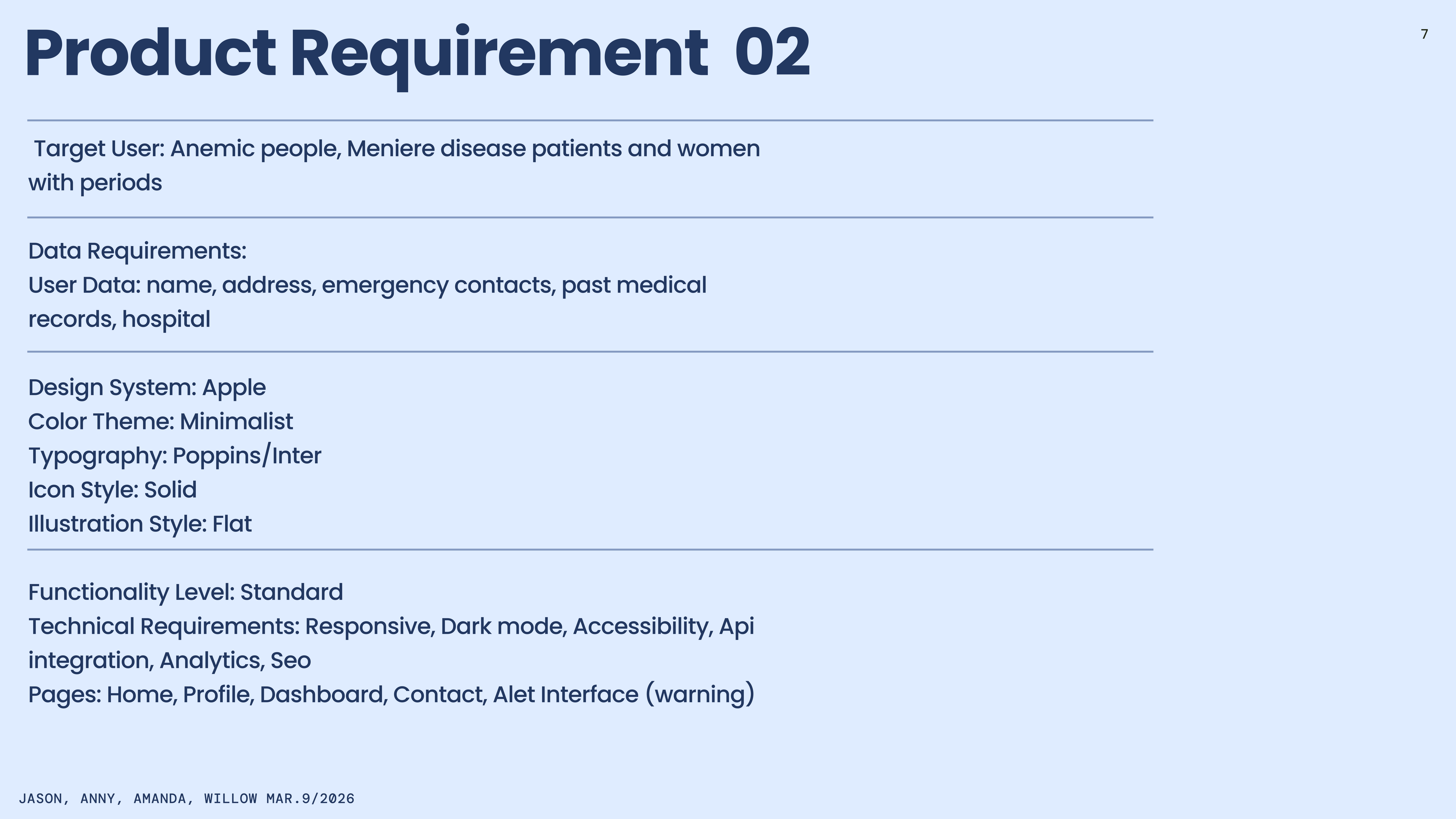
Willow identified the core mechanic: dizziness on standing happens when inner-ear fluid shifts with blood pressure drops. GVS sends tiny currents to the vestibular nerve — muting the dizziness signal, replacing it with steadiness. Target users: anemic people, Meniere's patients, and women with period-linked vestibular episodes.
PRD
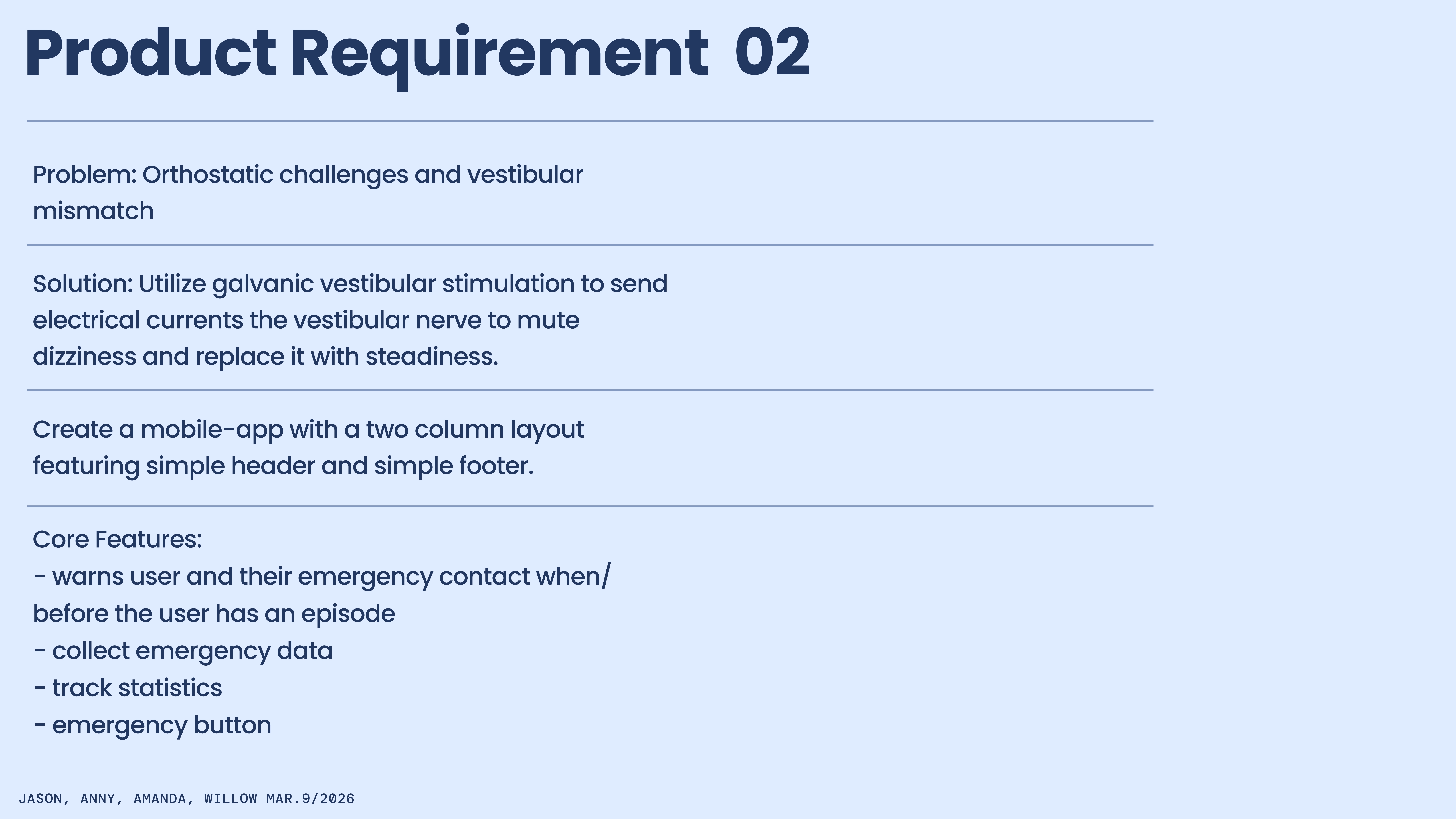
In a 72-hour sprint, a PRD isn't overhead — it's the single source of truth before anyone opens Figma. Without it, four people build four different products in parallel.
It locked the problem (orthostatic challenges, vestibular mismatch), solution (GVS companion device), users, four core features (predictive warnings, emergency data collection, statistics, emergency button), and the design system upfront — Apple HIG foundation, Poppins/Inter typography, calm minimalist palette, flat illustration, dark mode, accessibility.
User flow
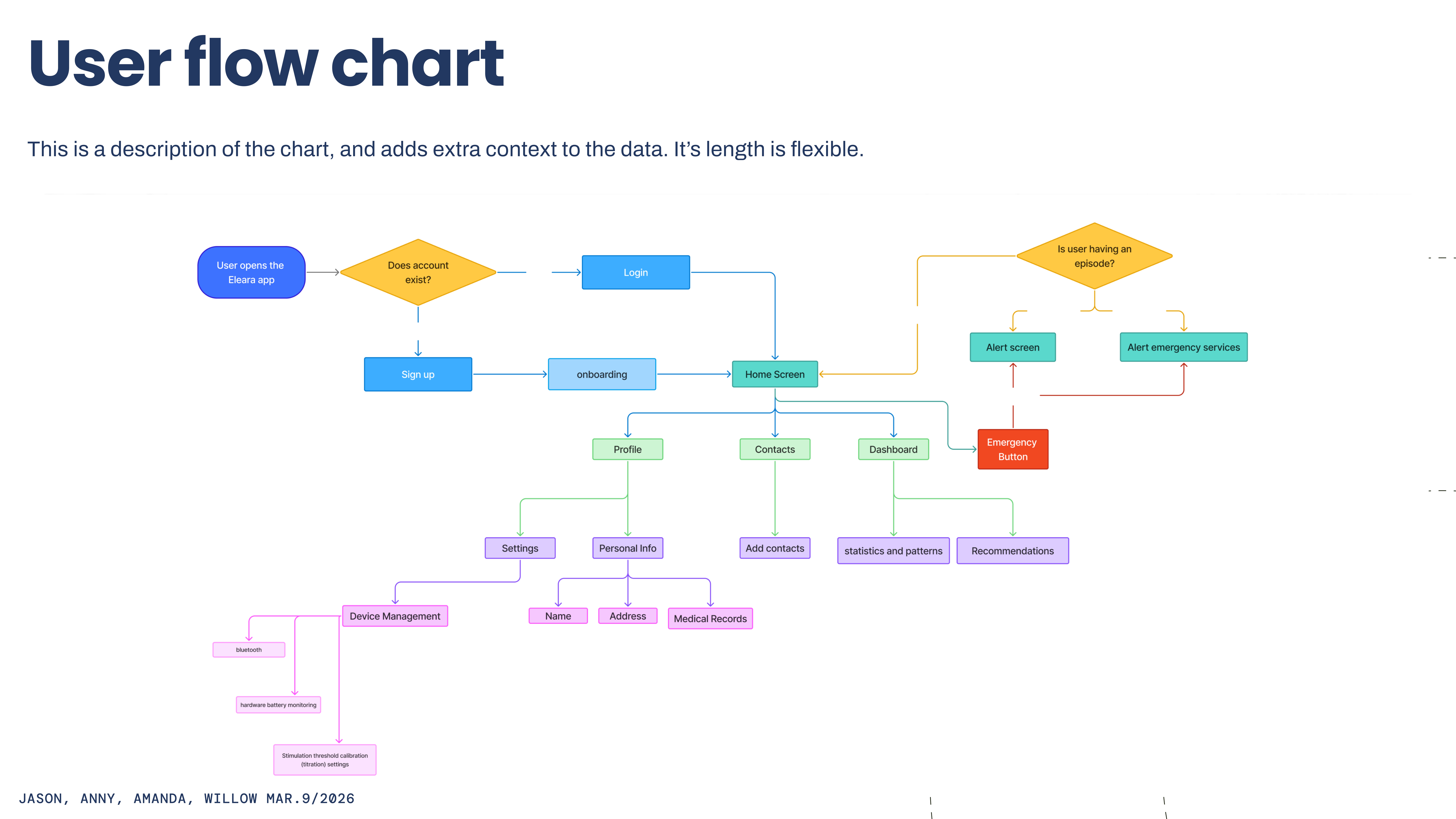
I led the user flow — one of my direct design contributions alongside PM work. Eleara had to handle daily use and emergency response without confusion between the two paths.
Core logic branches on one question after login: is the user having an episode now? If yes → alert screen and optional emergency services notification. A persistent Emergency Button on home provides manual override anytime.
Normal use flows through Profile (medical info, device settings, GVS threshold calibration), Contacts (emergency list with auto-notify toggles), and Dashboard (episode stats and pattern insights). Mapping this before wireframes meant nobody built a screen without a logical place in the system.
Wireframes
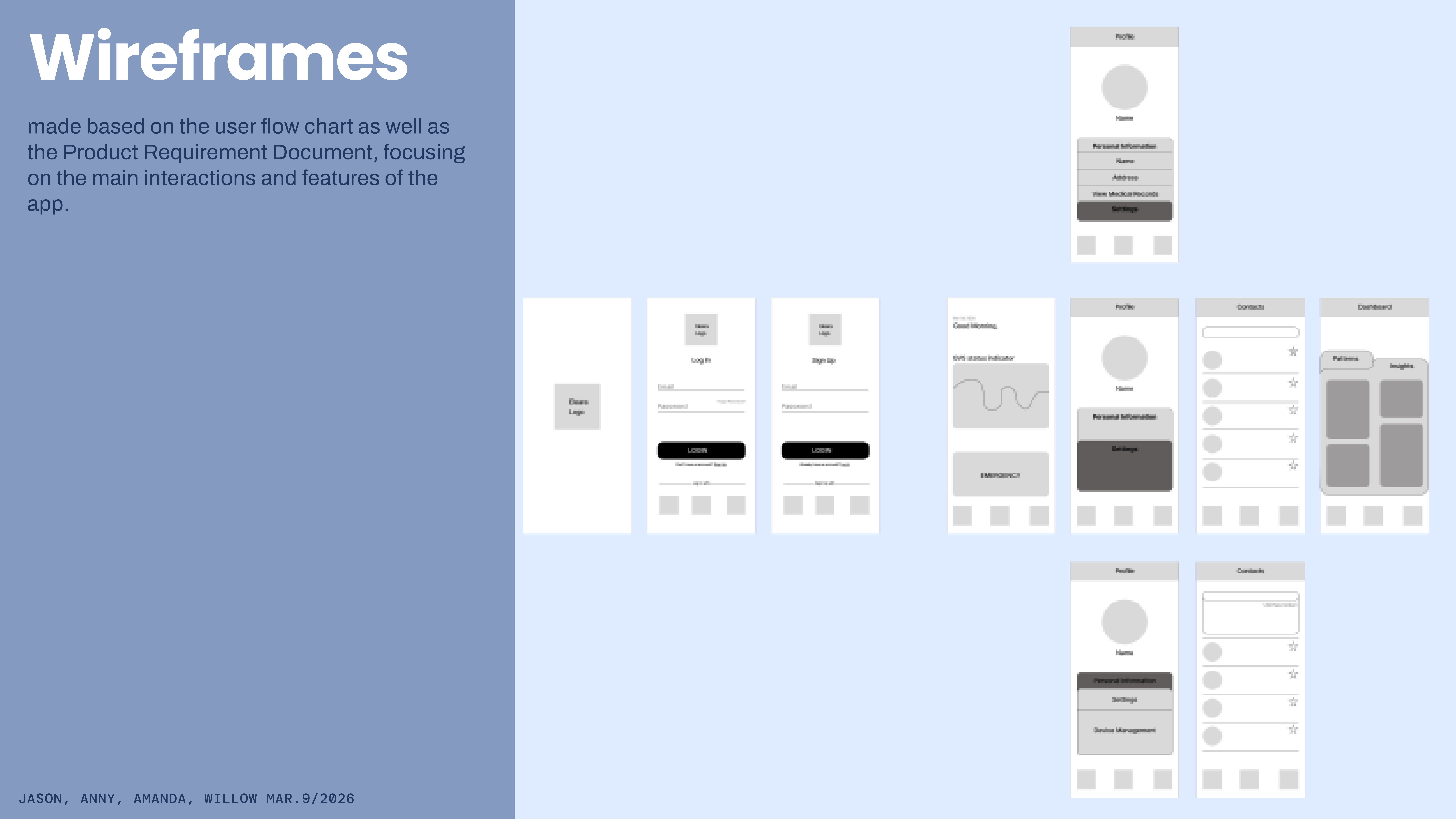
With the flow mapped, wireframes were layout translation — content hierarchy and actions per screen, no visual styling. Covered splash, auth, home with GVS status and emergency button, profile tabs, contacts, and stats dashboard.
The PRD's two-column card layout and persistent bottom nav were roughed in here. Grayscale intentionally — structure first, visuals in the style guide.
Style guide
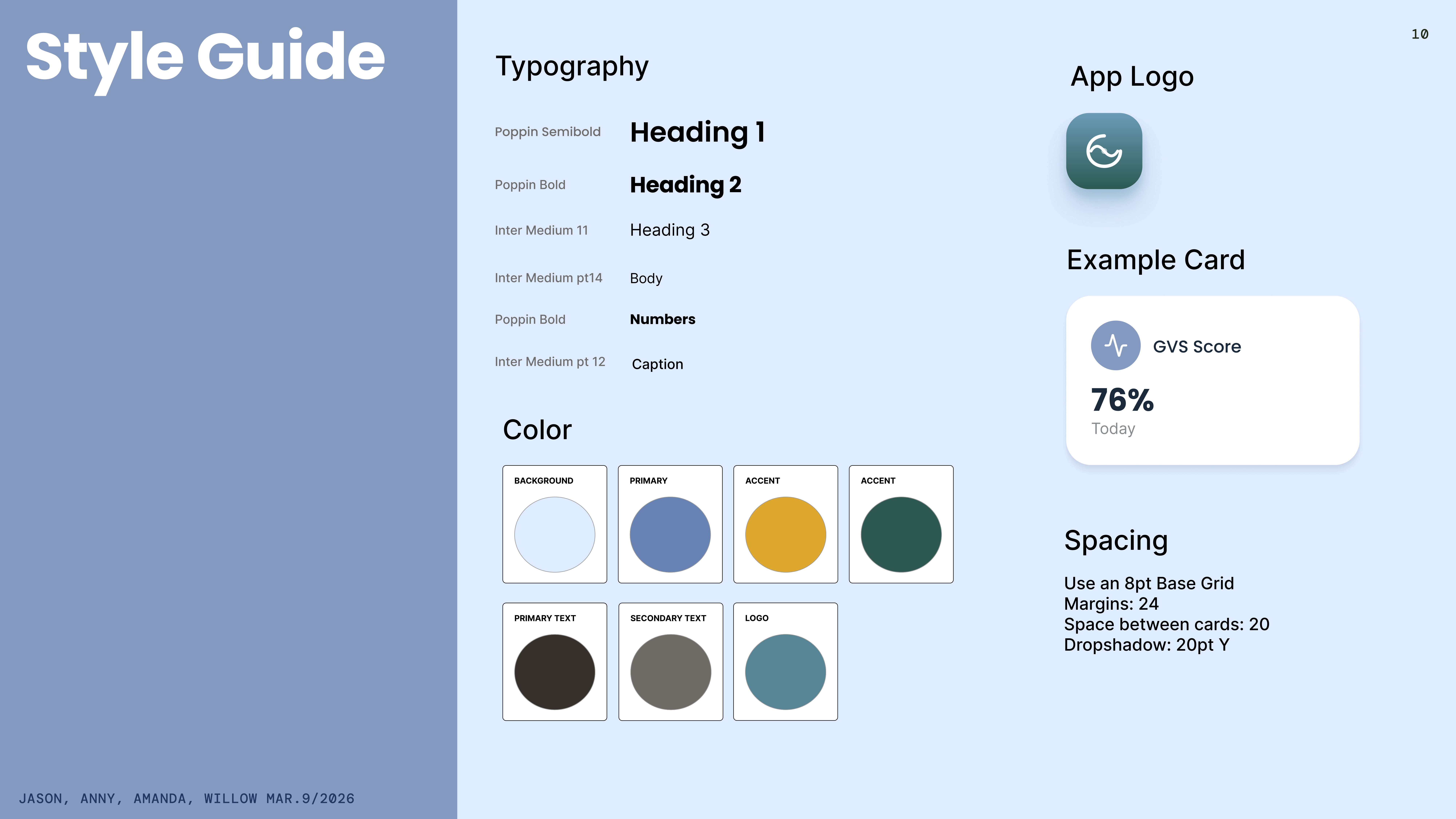
Built in parallel with wireframes so the team could produce high-fidelity screens independently without visual drift. Poppins for headings and data (geometric, confident at a glance), Inter for body text (legible at small sizes during an episode).
Palette: soft periwinkle background, dusty blue primary, warm amber accent, deep teal for positive states — clinical but not cold. 8pt grid, 24pt margins, 20pt card gaps, 20pt drop shadows for depth without noise.
Day 2
First draft
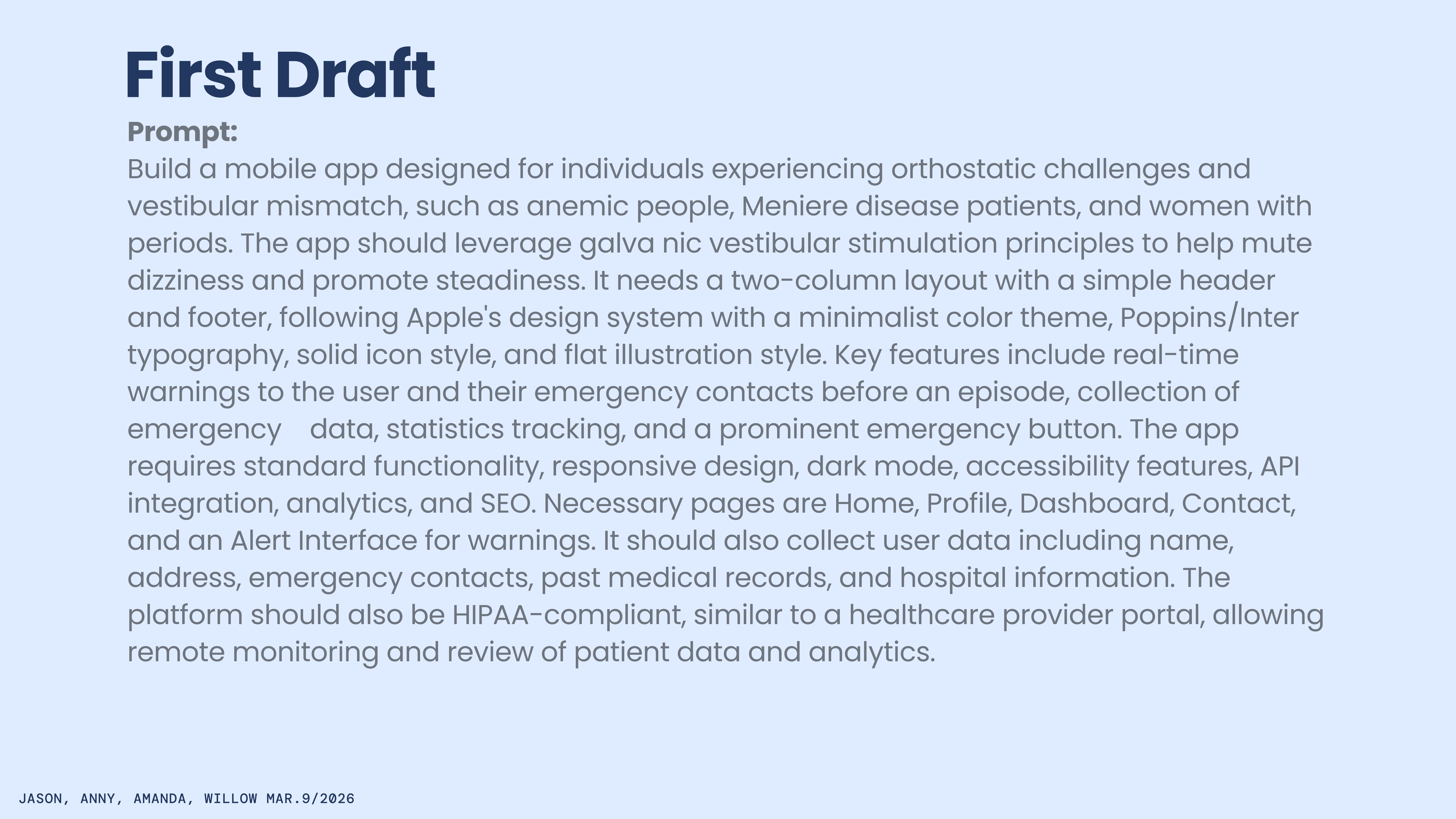
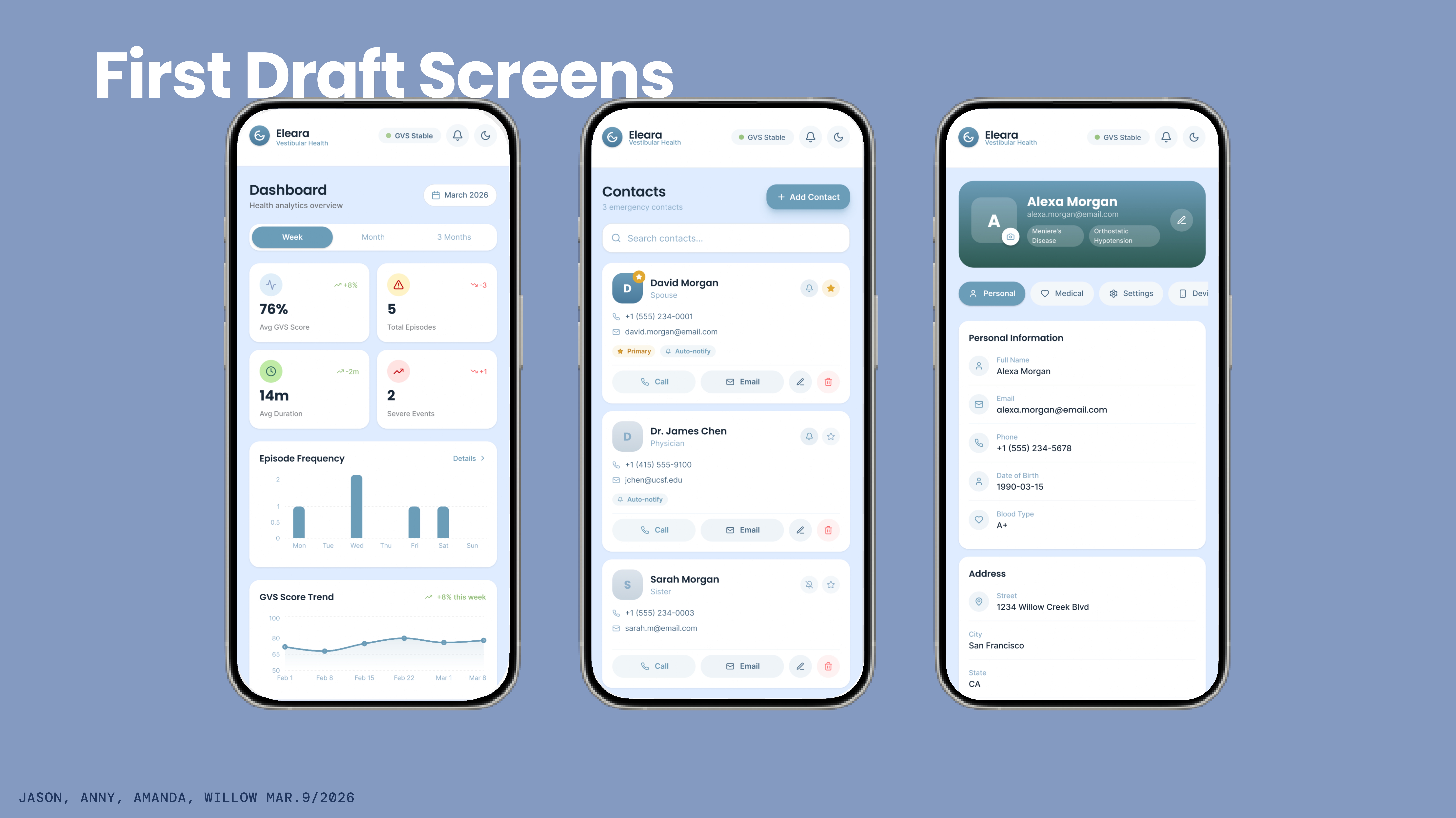
Day 2 opened with a FigmaMake build from a prompt encoding the full PRD — users, GVS mechanic, two-column layout, typography, features, HIPAA requirements, and every required screen.
The draft had solid bones: Dashboard with GVS Score, episode stats, frequency chart, and trend line. Contacts with auto-notify toggles. Profile with personal info, medical records, and settings tabs. My role shifted to feedback synthesis — reviewing screens as they arrived and keeping the team aligned on what needed to change before user testing.
User testing
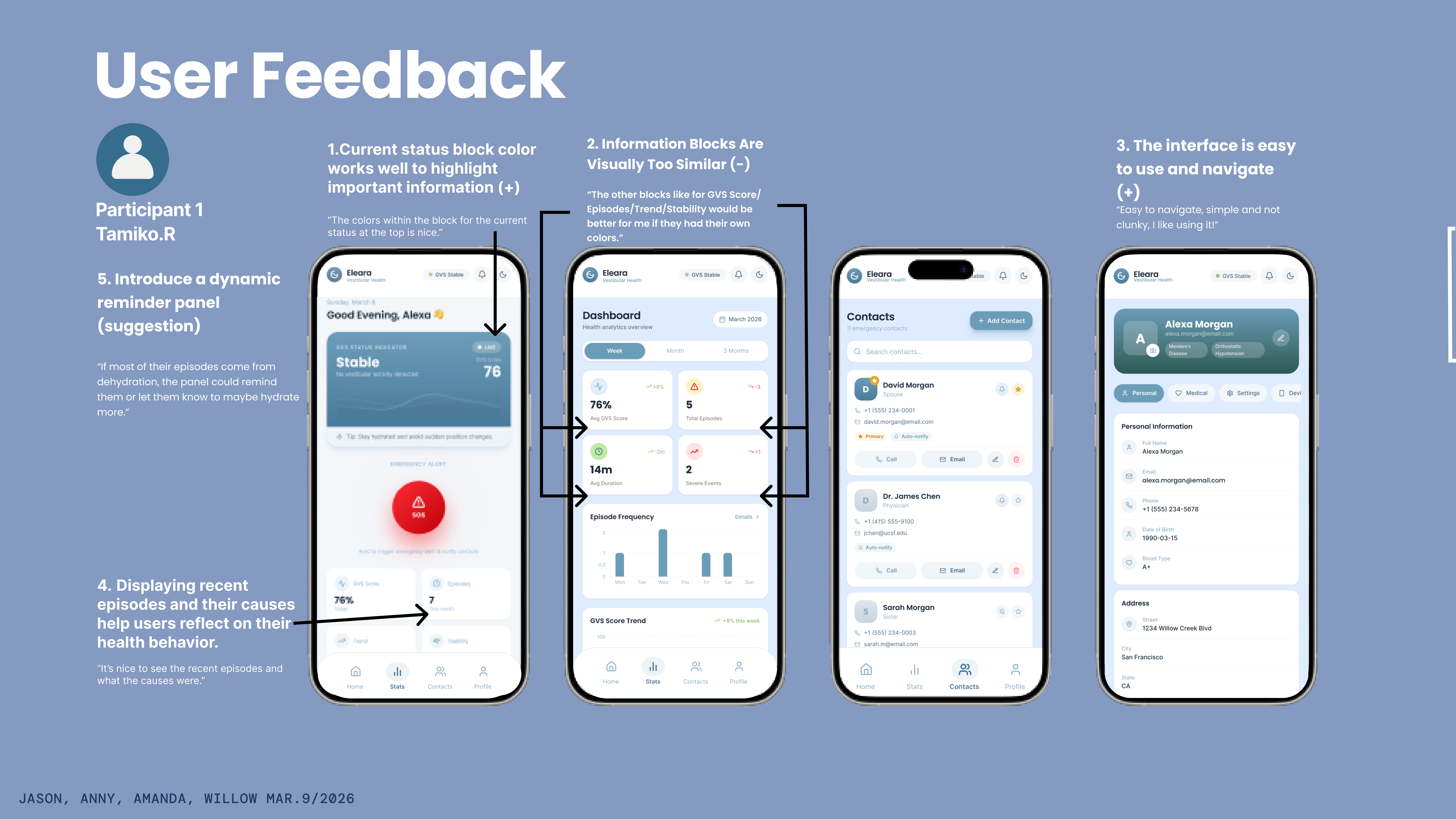
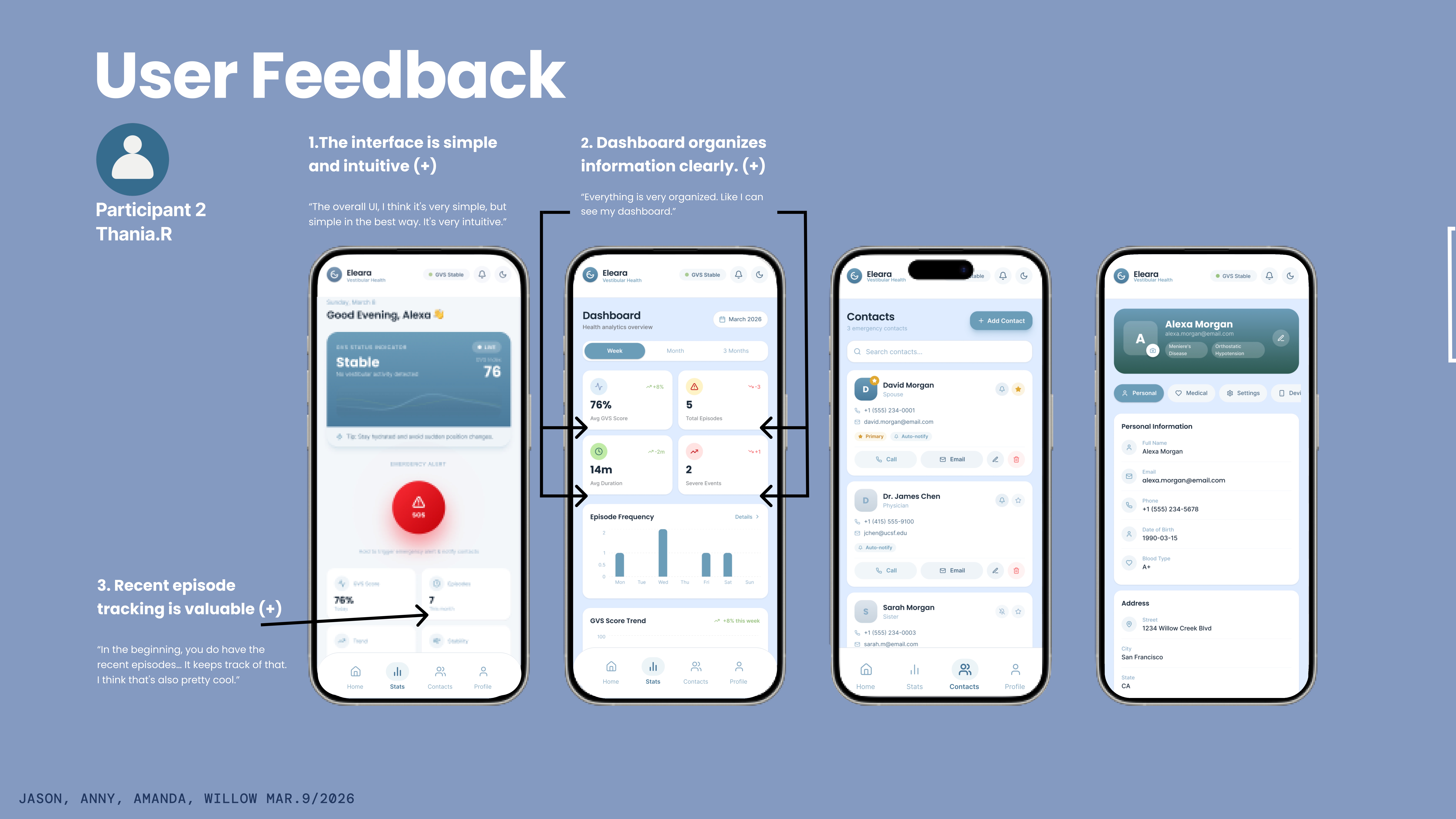
At hour 36 of 72, we tested with two participants — Tamiko R. and Thania R. — navigating key flows while thinking aloud.
Tamiko valued the home screen status color system but found dashboard cards too visually similar — she wanted distinct identities for GVS Score, Episodes, Duration, and Severe Events so she could scan without reading every label. She also suggested dynamic reminders: if dehydration triggers episodes, the app should suggest hydration, not just display data.
Thania found the interface 'simple in the best way' and valued episode tracking for reflecting on health behavior, not just monitoring it. Both confirmed the core hypothesis: approachable interface, sensible information structure. Refinement problems, not structural ones — exactly what we needed to hear at hour 36.
Iterations
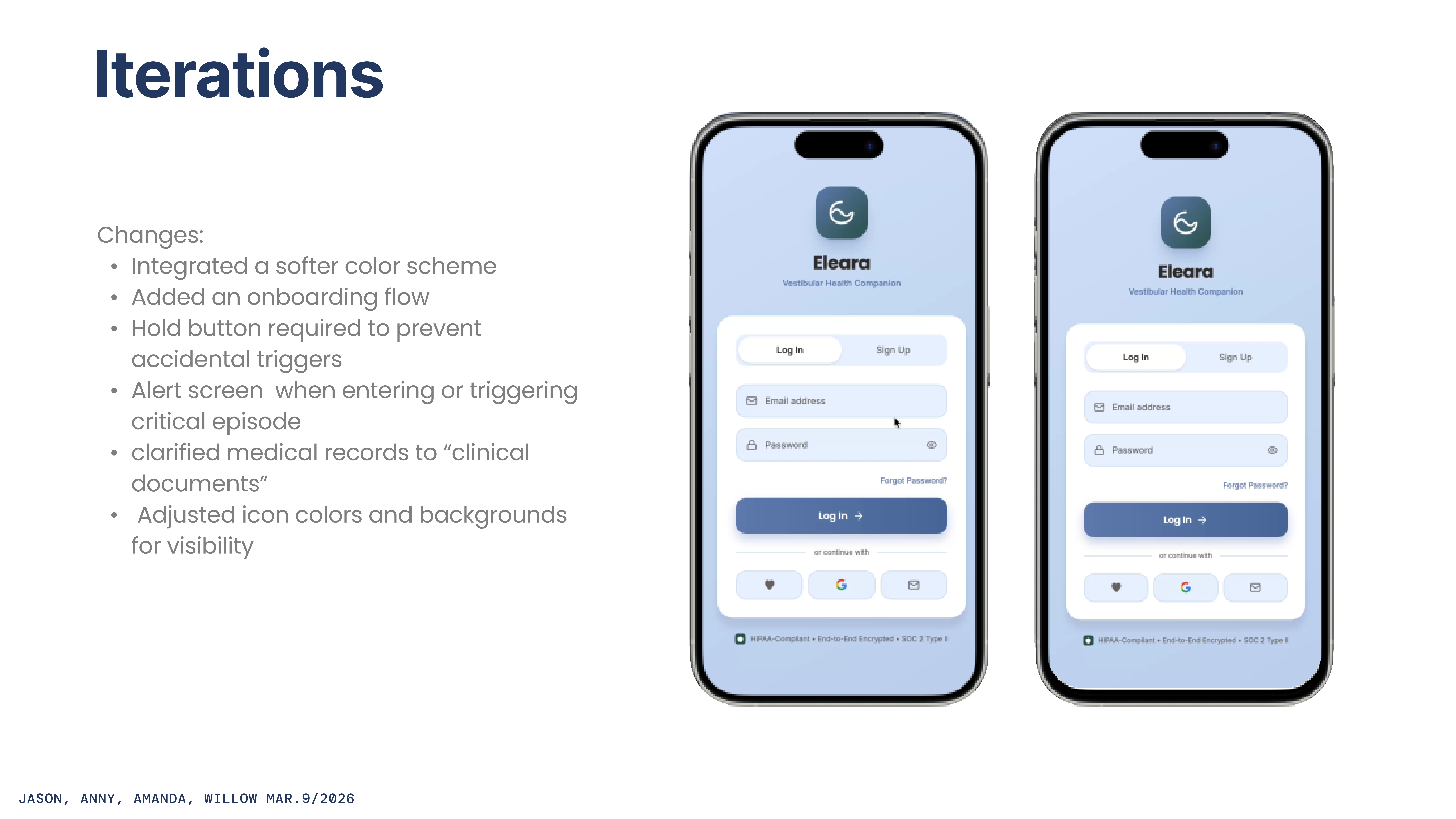
Six targeted changes before the final build:
Softer color scheme throughout — less clinical, more companion-like. Proper onboarding flow added (skipped in first draft; essential for health data and device permissions). Emergency button changed to hold-to-trigger — prevents accidental SOS in public without slowing genuine emergencies.
Explicit alert screen for episode detection — visually distinct from passive monitoring. 'Medical records' renamed to 'clinical documents' for clearer data sensitivity expectations. Dashboard card visual identity adjusted per Tamiko's scanning feedback.
Day 3
Final build

Day 3 was close-out: apply the iteration list, polish visuals, record the prototype walkthrough, submit.
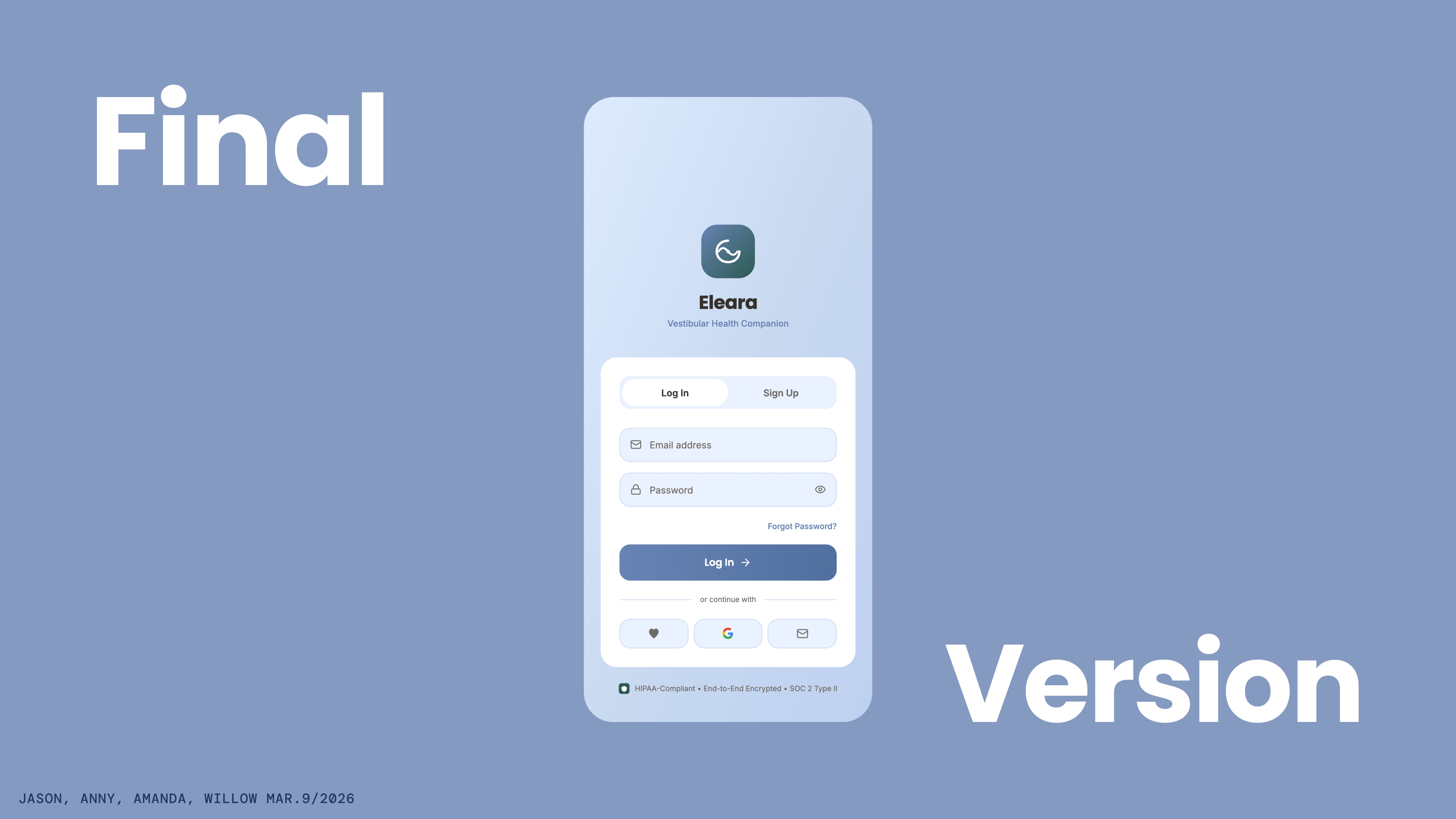
The final login screen shows the full system — periwinkle background, teal logo, Poppins typography, auth toggle, and HIPAA-compliant security certification visible before account creation. Hold-button emergency trigger, onboarding flow, and dynamic reminder concept all incorporated.
Credible, research-backed, user-tested prototype — built from scratch in 72 hours by a remote team of four.
Full deck · PDF
Full slide deck — download for the complete presentation.
Full slide deck (PDF, 19 pages) ↗Reflection
Eleara is where I learned what leading a design team actually means — not visual craft, but reading the room, making judgment calls under time pressure, and delegating to strengths instead of dividing work arbitrarily. What I'd do differently: ideation took six hours when I'd planned three. I should have capped it harder and trusted Day 2–3 iteration to compensate. What I'm proud of: we ran real user testing at hour 36 when most sprint teams skip it. Tamiko and Thania's feedback made the final product meaningfully better in ways we wouldn't have caught ourselves.